Favourite Australian Album Covers 2017

Well, it’s been a while since I’ve covered this, but being an area of certain interest to myself I figured the time had come around to give it another shot. The main reason I stopped  doing it a few years back is because i was having such a hard and frustrating time coming up with with a substantial enough list to make it viable. Design for music really seems to be in the doldrums in Australia, even as I noticed a significant uptick in quality the quality of overseas cover design in 2017. Maybe we just need a bit of time to catch up. My choices are based on the sole criteria of ‘I wish I had done that’, so judge the results as you will. There are some fantastic contributions to the form below, mostly coming from the fringes of what you would regard as mainstream releases. I’ve got to say it was a real slog coming up with what I regarded as worthy inclusions, but maybe I’m just not thorough enough or I’m getting too old to know what ‘the kids are down with these day’. I’ve always held that if the musical artist cares enough about their records, then more often than not, they will package it in a design that shows the care they’ve put into it. Maybe in this age of Spotify and Apple music it’s just not a consideration anymore. Most of these albums are also available as vinyl releases, they certainly deserve to be presented in that format. I haven’t tried to credit the designers /artists/photographers behind the covers this year, is was holding me back from actually putting this up, digging for credits for every piece, but please feel free to get in contact if you know of any and i’ll add them accordingly, in fact, If you are one of the creators of these pieces I would love to hear from regardless. As I’ve said above, these are my favourites, if you have any of your own please feel free to leave a comment, I’d certainly love to see any crackers that I might have missed.

41hyfz7KHkL

A great, beautifully simple design by Traianos Pakioufakis (check out some more great album design on the site), for Jen Cloher’s self-title album. It’s really comes down to the sublime candid photograph by Luke McLean Stephenson (the black edge of the pic poking through is a nice touch). The restraint in the design is what really works for this cover, it helps that it’s a cracking batch of sons to listen to as well!


monster-children-vinyl-art-5

King Gizzard & The Lizard Wizard released 5(!) full album releases in 2017, the above is just one example, they are all great designs, awesomely produced by the great Jason Galea. Nice to see a current band so involved with producing good music and great visuals.


Cut-Copy-Haiku-From-Zero

This is an album that has sort of snuck under the radar, I haven’t really heard much about it at all for such a high-profile Australian act. That said, I like the cover, and Cut Copy seldom disappoint with their artwork – sort of a through-back to the 90s, it has that late Not Only Black & White magazine aesthetic happening (design by vocalist Dan Whitford) – plus the imagery forms a kind of visual haiku if you look at it long enough.


The Kite String Tangle-The Kite string tangle

A great image can make all the difference as this cover demonstrates. It’s an engaging graphic used here (not sure if it’s a photo or some photoshop trickery) by The Kite String Tangle – I like the little logo in the bottom corner there too but I’m not sure whether it distracts too much from the overall visual. Great colour range too.


Realclassact

Country music isn’t renowned for it’s engaging album cover imagery, but Fanny Lunsden’s cover here for her album Real Class Act is a definite exception in that regard. Even a seemingly simple photograph can be used to stunning effect when handled right. I love the choice of typeface in the top left corner as well, I only wish the artist’s name had been similarly considered, as it kind of spoils the overall effect tucked there in the bottom right-hand corner.


Methyl Ethel

Methyl  Ethel have been getting plenty of airplay and some love from international music mags like NME. As you would expect from an outfit described as an ‘Art Rock Band’ the cover comes with the requisite ‘first year of art school’ painted nude, aesthetic -(by Holly Fewson) which is actually meant as a compliment, there’s a really nice freshness to it, in contrast to the choice of that black background which gives the cover a bold standout quality. I’m sure this looks stunning on the full 12 inch album, brave choice to leave the band name and title off only their sophomore release.


cherry_dolls_viva_los_dolls_0717

There’s alway room for a bit of nostalgia when it’s handles just right. The name ‘The Cherry Dolls’ lends itself  to such a treatment – and they’ve certainly gone with it. There’s kind of that early 80s indie record artwork thing going on there too with the hand script at the top and the colour overlay. It’s in ‘full stereo’ too! Which is always good to know.


Holly-Throsby-After-a-Time-iTunes-cover-2-1024x1024

There’s nothing particularly ground-breaking about Holly Throsby’s After a Time cover, but in a year worth of covers that couldn’t be bothered, I thought it would be nice to finish up on something that shows just a little bit of thought can produce something quite sublime and appropriate – needless to say the typography is well considered also.


Monday Load of Links

With 2018 upon us, it’s time for me to rise from my pit of self-imposed ennui and into the light of a brand new year and a brand new lot of design links to engage you with!

Does your design suck? Well it won’t get any better if you don’t stop picking at it and don’t keep these five things in mind.

I’ve almost finished compiling my list of my favourite Australian album covers of 2017, in the meantime, why not check out The Creative Review’s rundown of their favourite 2017 album covers from all over the place and the best music videos of the year as well.

And while we’re on 2017 best of lists, here’s Literary Hub’s 64 best book covers of 2017.

2017 is dead, long live 2018! Here’s a list of design trends that need to die along with it.

Why do we keep thinking we’re seeing sexual anatomy in logos? Is this really a problem?

2017 was often a frustrating year for me – so good advice to tackle 2018 with is greatly appreciated!

Another great interview from The Great Discontent. Gary Taxali was one of the first illustrators/designers I really took notice of when I was studying. It’s great to see he’s still round and still producing great work.

The New York Times is one of the great bastions of editorial illustration. With the various goings on in the US at the moment, the year was a particularly strong one for their use of various innovative spot illustrative elements. Here’s a really great rundown of some of the best pieces produced through 2017.

Print magazine is shutting up shop – on its print edition at any rate. I’ll really miss their young creatives overview and their regional design annual.

But don’t despair! It looks like printed magazine of many varied sorts will still continue to go strong in 2018. Here are some predictions on what forms they may take.


Monday Load of Links

As Christmas and the end of the year draw nigh, so does your weekly dose of design related goodness collected from all around the web-o-sphere. Will Santa grant your wish with a Monday Load of Links next Monday? Leave out a glass of milk and a Scotch Finger Biscuit next Sunday eve and see!

Michael Carney has been consistently maintaining the visual image of the band The Black Keys (as well as some other cool performers like Randy Newman!) over multiple releases. This is a great interview with him on his work and working within the music industry. If you haven’t guessed, I’m a big fan.

Those crazy Russians during the Soviet era sure did like to make a statement in regards to what we would consider the most utilitarian of public spaces. Check out these oddball bus stops from that time photographed by Christopher Herwig.

Personal Style vis client expectations is the slippery slope most of us working designers navigate on a working week basis. These three art directors talk on how they handle the balancing act.

A lot of us grew up poring over the typographic experiments of The Face magazine, Raygun and Not Only Black and White magazine if you live downunder. I’m not sure those rule-breaking days of contemporary magazine design are of much concern to the average consumer these days as we would like to imagine, but maybe a more subtle approach to typography is winning readers over?

Did you make an impact on design in 2017? If your name’s not on this list, then, obviously, you must try harder!

Design thinking as an STD, nice.

The Casual Optimist is my church this time of year as I worship at the altar of the most notable book covers of 2017.

And speaking of great book design, there’s still time to enter The Australian Book Design Awards if you’ve created any noteworthy tomes of your own in the past year (you have until December 22 to enter).

Rules for working in a studio, actually pretty good rules for working anywhere.

Is design enough to change the world? We’ll get right onto it after rock ‘n roll does I guess.

Monday Load of Links

Back after a short vacation to Melbourne to see Sir Paul McCartney in concert. A large load of design related links to start of the working week (obligatory cat video back next week!)

Not my sort of music, but the Wu Tang Clan have certainly paid a lot of attention to their visual image over the years.

I’ve sometimes thought of starting my own Kickstarter project over the years )I’ve certainly funded my fair share of them), here’s some tips on funding your own Kickstarter campaign.

The Smudge reminds me of the type of publications produced by the British underground press in the 1960s. I’ve just purchased a couple of back issues and I’m really looking forward to reading them.

Speaking of the British underground press of the 1960s, this new book purports to include the cover of every British underground paper that launched in the sixties. I may have to purchase my own copy when finances allow after the Christmas season.

With each issue based around a single object, MacGuffin magazine is a platform for fans of inspiring, personal, unexpected, highly familiar or utterly disregarded things. It’s a beautifully designed magazine and weighing in at a hefty 220 pages, a thorough read. The latest issues is on ‘sinks’.

Looking to donate some money in this season of giving? Women Who Code and Design That Matters may be a good place to park some cash if you are in a charitable mood.

The Time person(s) of the year are the silence breakers. Thank God it’s not D2S.

Would you kill to work at one of these companies? (I might come close if Adult Swim offered). Interesting that The New York Times is one of the choices too.

Designer Dave Sedgwick discusses how to push a brief.

I’ve been known to take a Skillshare class or two. This one on The Art of the Story: Creating Visual Narratives by Debbie Millman looks fantastic (it features Paul Sahre as an added bonus!)

Legendary logo designer Ivan Chermayeff has died.

I really like these ceramic and porcelain ghosts.

What did graphic design look like in the medieval period? A question that I’m sure has been on all our minds at one point.

Lots of people reflecting on 2017 online at the moment. This is a pretty good list of what one person learned throughout the year.

Ultraviolet is the Pantone colour of the year.


AGDA Awards 2017 Reviewed!

The Australian Graphic Design Association awards for 2017 were held in the nation’s capital the other week with the glitter and pageantry that one would expect of such an event. I wasn’t there of course but in my self-appointed role as arbiter of great local graphic design (long on service, short on achievements) it behooves me, as I have in the last couple of years, to stumble into the party and cast my critical eye over the results. No one else is sticking their hand up this late in the game at any rate.

Once again it looked like it was a pretty good evening, with some well-deserving work being recognised and it seems, Voice and Fabio Ongarato Design being a commanding presence when it came to being awarded the gongs. Design awards are tough to get ‘right’ in a digital world where not too much work comes as a surprise when everything is online for all to see. There is as usual, a prevalence of a lot of the well-known names, also some glaring omissions that leads you to ask whether established studios have much interest in design competitions these days. The obvious questions again are, are they too expensive to enter? Is an annual event too often? Or do design firms just not see any relevance in it for themselves? Personally I’d love to see a bit more diversity, but I don’t have any un-obvious ideas as to how this might be achieved.

Just a note on how I do this. I look at the work of what work won a Pinnacle the highest honour bestowed) offer my opinion, and then check the finalists to suggest some of the work there that might have been in consideration for a higher award listing (may it be a pinnacle or moved up to a distinction placing). It’s all just based on my personal opinion of course, I don’t have any horse to run in any of this – though of course residing in Adelaide, I’m totally going to lean towards any outstanding South Australian entries, ’cause that’s how I roll, it’s not like I’m being paid for any of this. On that note, let’s check out the good stuff.

IDENTITY

Pinnacle winner: For the People, Sydney School of Entrepreneurship

ADB-2017NATIONAL-M016094-00002123-1502057846

Designer Jason Little, James Gilmore, Johanna Roca, Olivia King
Creative Director Jason Little
Art Director James Gilmore, Johanna Roca, Olivia King
Typographer James Gilmore, Johanna Roca, Olivia King
Finished Artist James Gilmore, Olivia King
Writer Andy Wright
Other Developer – Phil Havea, Damian Borchok – Executive Director, Andy Wright – Executive Director

Identity is a tough category to crack as you would expect, and this entry does a nice job of turning the typical institute of higher learning look on its head. For the People are fast becoming the experts for this sort of institutional re-invention.

Should have been a contender… Darklab: Dark Mofo

ADB-2017NATIONAL-M3077711-00002222-1502259529

Designer Megan Perkins
Creative Director Leigh Carmichael
Art Director Megan Perkins
Finished Artist Megan Perkins, Beth Gregory
Writer Luke Hortle, Anna Tutty
Photographer Rémi Chauvin, Jesse Hunniford, Mitch Osborne
Other Mick Fennelly, App Design; Daniel Reid, Website Developer; Art Processors, App Developer; Thomas Hyland, Videographer; Anna Tutty, Project Manager; Isabella Szukilojc, Project co-ordinator
Printer Mercury Walsh, Slick Promotions, Gus Smith, eyespysigns, Saunders Signs, Typeface, Shout Out Loud

The identity for Dark Mofo is threatening, unconventional and also a little ugly in parts are far as a conventional identity system goes – that said, I love it to bits – it looks like nothing else around – especially an expression of what you expect from a festival. As good as the School For Entrepreneurship identity is, it doesn’t push my expectations, make me as uncomfortable, and excite me as much as the work for Dark Mofo does here, so I feel is deserves to be moved up to Pinnacle status. I sometimes feel that the amount of judges involved in the decision process for the AGDA awards categories kick these more left field entries down the winning hierarchy list. Luckily judge Jo Roca knows the score.

Should have been a contender… Work Art Life Studios: St Martins Cafe

ADB-2017NATIONAL-M002153-00001605-new-4

Creative Director Andrew Ashton
Art Director Andrew Ashton
Typographer Andrew Ashton
Illustrator Andrew Ashton
Paper Mohawk Eggshell, Envirocare

The little guy has a hard time being noticed in such an all-encompassing category as ‘Identity’ as well. As far as a complete identity package of custom typography, colour and graphics, for a cafe no less, goes – this package is the bomb, and deserves to be moved up into distinction status methinks.

Print

Pinnacle winner: Impact BBDO: Making Sense of Dyslexia

ADB-2017NATIONAL-M3042168-00002293-1502389932.jpg

Designer Mohamed Samir
Creative Director Ryan Atkinson
Art Director Ryan Atkinson
Typographer Rijin Kunnath
Writer Jamie Kennaway, Stephan De Lange

Thumbs up for the intention, something bothers me a little bit about the execution though – aesthetically, it’s beautifully designed – but maybe that’s what bothers me – is it too attuned to the designers sensitivity than that of its intended audience? It’s clever and fun though, and if it has raised awareness it far outweighs my concerns.

Should have been a contender… Creature Design: Lux Night Light Festival

ADB-2017NATIONAL-M3078056-00001753-1501725223

Designer Janelle Rodrigues, Hannah Dollery
Creative Director Janelle Rodrigues
Other Niels Hunefield, Wayne Holmes, Ali Jamieson

In a category filled with art catalogue finalists, it was difficult to pinpoint anything that really blew me away as far as uniqueness and skill of execution. The pieces for Lux piqued my interest though with some great typography and unusual graphics. This really seems more suited to be positioned under identity though don’t you think?

Publications

Pinnacle winner: Voice: Land Sea You Me
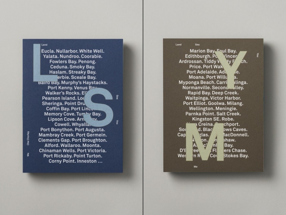
ADB-2017NATIONAL-M006675-00001670-1502412347

ADB-2017NATIONAL-M006675-00001670-1502412437

ADB-2017NATIONAL-M006675-00001670-1502412514

Designer Anthony De Leo
Creative Director Anthony De Leo
Typographer Anthony De Leo
Finished Artist Anthony De Leo
Writer Che Chorley
Photographer Che Chorley
Illustrator Aona Hayashi
Paper Stephen, Pacesetter
Printer Finsbury Green

Anyone who says you cannot be moved by the combination of typography, illustration and photography in a simple printed package needs to have a good hard look at this piece. A worthy Pinnacle winner and my pick of the whole show. Now I just need to dig this up somewhere so I can drool over the actual book!

Should have been a contender… Frame: Lux Krass Journal III

ADB-2017NATIONAL-M3044048-00002181-1502509915

Designer Simon Pearce
Photographer Sven Kovak

Starting to sound a bit like a broken record here, but, the third year Krass Journal has been a finalist in the awards, and the third year it hasn’t progressed from there. Publications was a tough category this years, lots of really great work, but I’m a little disappointed Krass wasn’t awarded at least a distinction, especially with this issue being the best produced yet (it was already at a pretty high standard). It’s a great mag and deserves the support. Once again I think it’s a victim of the ‘too many judges’ diluting the left field entries.

Should have been a contender…Design by Toko: My Sister Is a Martian

ADB-2017NATIONAL-M3061395-00001916-1501795399

Designer Eva Dijkstra, Michael Lugmayr
Creative Director Eva Dijkstra
Art Director Eva Dijkstra
Typographer Eva Dijkstra
Finished Artist Eva Dijkstra
Writer Beau Neilson
Illustrator Hudson Christie
Printer 1010 Printing

This won a Distinction for its cover, but I think the judges missed the boat a bit by not awarding that particular gong to the whole book instead. While the cover is obviously a typographers wet dream, the insides are at a whole ‘nother level – this is a beautifully designed all-over package – and what a surprise – produced by Toko!

Packaging

Pinnacle winner: No Pinnacle awarded

Should have been a contender… Band: Jeanneret Wines

ADB-2017NATIONAL-M015801-00001413-new-1.jpg

Designer Shane Keane
Creative Director Chris Cooper

With so many great wine bottle design, the judges obviously couldn’t pick a worthy Pinnacle winner, but if anything perhaps stands out, it’s these beautifully atypical designs by Band. There’s a lot going on in the design of these than might immediately catch the eye on just a cursory examination. There’s obviously the stunning typography that Band seem to produce so effortlessly, but there’s also some sublime colour choices and textural embellishments that really speak of the thought that has gone into producing an outstanding package. I would want to just keep these on my shelf and never drink them!

Should have been a contender… Black Squid: Opulent Moon

ADB-2017NATIONAL-M002030-00001778-1501812485.jpg

ADB-2017NATIONAL-M002030-00001778-1501813555.jpg

Designer James Bobridge
Creative Director Derek Butler

Black Squid have been producing some great packaging design of late. I really like the fun edge of these labels – the name alone is enough to produce something cool from – the treatment goes a step further and really makes the design speak.

Should have been a contender… The Company You Keep: Love Tea
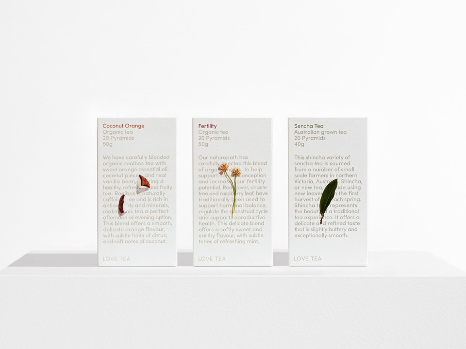
ADB-2017NATIONAL-M3069185-00001440-1499822244

Designer Luke Brown
Creative Director Rhys Gorgol

It’s a brave studio that pits some simple tea packaging against the might of the countries best wine label design in this category, but I really like the simplicity of these handsome tea package designs. Black Squid also had some lovely tea packages as finalists, but I think I like these just a little bit more.

Digital

Pinnacle winner: Houston Group: UTS Brand Visualiser
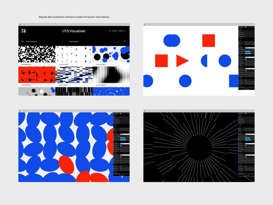
ADB-2017NATIONAL-M3048912-00001827-1501723418.jpg

Designer James Calpis, Gian Lacanilao, Dana Rogers, Nathan Wren, Michelle Whitehead
Creative Director Alex Toohey
Typographer Eduardo Manso, emtype
Other Account Management; Anne-Louise Carlon, Kyle De Raedt. Strategy; Stuart O’Brien, Joanna Lilley, Cara Meade, Kalina Gondevska, Allison Sims. Software Development; Mentally Friendly

This kind of neat, the identity system was already pretty good, and this looks like it lets you remix the elements to suit your needs – a glimpse into the future of how identity systems will evolve I imagine!

Should have been a contender… Sons & Co: Mary Gaudin Website

ADB-2017NATIONAL-M020940-00001410-1499649469

ADB-2017NATIONAL-M020940-00001410-1499649480

Designer Matthew Arnold, Paul Bright, Josh Wilson
Creative Director Timothy Kelleher

Sons & Co just seem to have an uncanny knack for turning expectations on websites on their head. This is an oddly endearing presentation using an unusual digital colour palette and seemingly random typographic approach that all pulls together into a rather comforting and homespun feeling. An expert execution in making a gallery site into something quite sublime.

Motion

Pinnacle winner: No Pinnacle awarded

Nothing really stood out for me in this category to make a further comment on.

Spatial

Pinnacle winner: Fabio Ongarato Design: QT Melbourne

ADB-2017NATIONAL-M007545-00002265-1502352948

Designer Nuttorn Vongsurawat, Ben Kluger, Sarah Cope.
Creative Director Fabio Ongarato
Photographer Mark Roper
Other Illustrator: Stuart Patience. Interior Designer: Nic Graham & Associates.

This was definitely the ‘Fabio Ongarato Design’ category of the award, not only pulling in the Pinnacle, but also four distinctions as well. ‘Lavish’ is probably the best way to describe this design for QT Melbourne – all of their entries in spatial are obviously stunning, and it was probably a toss-up over which of the five would be chosen to collect ‘the big one’.

Should have been a contender… Fabio Ongarato Design: Kisumé

ADB-2017NATIONAL-M007545-00002283-1502427402

Designer Mami Sugano, Tim Royall
Creative Director Fabio Ongarato
Photographer Mark Roper
Other Architects & Interior Designers – Wood Marsh Architects. Artist, Photographer – Nobuyoshi Araki.

I’m not sure why the judges didn’t just give them the even half-dozen by awarding Kisumé a distinction as well. I think it’s actually my favourite out of their 6 finalists.

Design Crafts

Pinnacle winner: Havas: The Bottom 100

ADB-2017NATIONAL-M3065288-00001637-1501838455

Designer Darren Cole, Nic Adamovich
Art Director Jeremy Hogg, Darren Cole, Nic Adamovich,
Writer Kevin Masters
Photographer Danny Leclair, Eliza Crosbie, Finch, Gita Buga, Mark Leaver, Natasha Stoughton, Prakash Daniel, Thomas Rens Leask
Other Executive Creative Directors – Seamus Higgins, Stuart Turner

Retouching – Cream Studios, Lee Hulsman

I really love this whole project and the photography is obviously stunning and on point.
I would love to have seen this nominated in either the publication or identity categories where I feel the depth of the project might have had more of an overall impact and made a larger statement over the awards. More stuff entered like this please!

Should have been a contender… Juicebox: Feral Fest 2016

ADB-2017NATIONAL-M3070539-00002198-1502180598.jpg

Designer Vaughn Hockey
Creative Director Joel Pember
Typographer Vaughn Hockey

In a year where the overwhelming amount of the finalists featured very clean austere no-nonsense design, it’s nice to see that someone got through who doesn’t mind getting a bit grubby with the typography where appropriate.

Student

Pinnacle winner: Alistair McCready: Type As Monument

ADB-2017STUDENT-M3070377-00001795-1501791204

Institution Auckland University of Technology
Programme Leader Peter Gilderdale
Designer Alistair McCready

Hey! A Pinnacle awarded to a student for the first time. Well done to Alistair, the book looks like a mammoth effort!

So there’s another years AGDA Awards done and dusted. overall, another good showing of work – if I had any minor criticisms it would be that most of the finalists consisted of very neat, tidy and considered design work, I would have loved to have seen more pieces that boroke out of that mold a little more. I also think, and this is a long-standing opinion of mine – there are too many judges for each category, which, in any design awards, tends to dilute any dissenting, out-there work. I’d rather see something wild and strange creep in to the finalists, than overall homogenous, but cleanly designed work be the constant norm. It would also be great if more people entered of course, so we could get that greater range – there’s lots of fantastic work out there around the country that deserves the recognition.

Make sure you check out all the finalists work of the AGDA awards site, as well as the finalists and winners from previous years. Please feel free to leave your opinions in the comments section and suggest any other pieces that you think were standouts from the awards.

Monday Load of Links

If it’s links you want, then it’s links we’ve got. Start your working week on an inspirational and aspirational note with some great design articles to brighten the Monday morning blues.

After a tough week I can relate (I am a snowflake too). On creativity and depression – more often than not they go hand in hand unfortunately.

Sometimes just seeing some fantastic design work can brighten your day. In that regard, I really like this book cover by Erik Carter.

I like looking at some fancy, schmancy beautifully designed websites too!

I seem to remember these guys being ‘kind of a big deal’ in the ’90s. Great to see that Why Not Associates are still kicking along at 30 years strong.

The history of the involvement of women in the growth of graphic design has been sorely lacking, luckily that is slowly beginning to change with the help of articles like this.

The Casual Optimist delivers the good stuff every 30 days with their review of Book Covers of the month.

King Gizzard and the Lizard Wizard don’t really produce my sort of music, but as far as pushing the creativity of their releases go, they are one of the most exciting musical groups around. Their latest album titled Polygondwanaland, (their fifth release this year alone!) is completely free to own, use and manipulate, including a toolkit of long-time collaborator Jason Galea’s artwork.

We should be encouraging diversity in the design industry. Here’s some ideas on how to do just that.

The Great Discontent has the best interviews with varied creative talent you will find anywhere. This article, with one of my personal design idols, Gail Bichler, is a prime example. Seriously, if you are of a creative persuasion, this site should be at the top of your favourites list.

Can logos become their own legends? The BBC thinks so!

I am a comic book nerd and I want to read these comics badly.

I am also a science nerd. If any of you are looking to buy me a Christmas present this year, I have a suggestion.

Sometimes it’s a good idea to step back and ask yourself some questions. These are some pretty good ones to consider!

The Rules of magazine design are changing it seems.

And on that note, digital is dying apparently. We told you so.

Why good design alone won’t attract millennials to your company. You need balloons as well don’t you know.

Sheila Levrant de Bretteville is an amazing graphic designer that enough people haven’t heard of.

There were some Australian Graphic design trophies awarded the other week. All the winners are up on the awards site now. Keep an eye out for my totally unbiased overview on Facing Sideways soon!

Designers Who Are Better Than Me

116_npsp_ewat_1

Motiv are one of  the great Adelaide design firms that seem to have been around forever. They continue to produce great work. Longtime company director Keith McEwan has recently retired and the reins have been taken over by his daughter Hannah and longtime employees Peter and Leo. Their website has had a major upgrade as well, and features many stunning pieces that run the gamut of graphic design mediums. If you are looking for examples of good, solid, honest design work, the Motiv site is the perfect place to start.

Monday Load of Links

Ease into the start of the working week with some design food for thought and inspiration.

Vaughan Oliver is the designer behind the look of the classic 4AD music label, for artists such as The Pixies and This Mortal Coil. He has a Kickstarter campaign for a new book that you can donate to.

Stackmagzines.com has their finalists up for their annual magazine awards.

Pentagram partner and graphic designer Natasha Jen talks about her favourite and most challenging work.

IBM wants to create the Helvetica of the 21st century for some reason.

Oliver Jeffers is an an amazing talent across various creative disciplines. Here he talks about art, the universe and everything.

Ivy Ross is the Head of Design for Hardware at Google, here she discusses how human connection is essential to your bottom line.

Stefan Sagmeister will critique your design work on Instagram.

Ever wonder how other creatives ‘get-up-and-go’ in the mornings and wind down at the end of the day? Extraordinary Routines has got you covered.

There seems to be a recent influx of magazines covering issues of mental health and well-being, sign of the times or a passing fad?

The 1980s and 90s were the glory days of album cover design, with labels like 4AD, Stiff and Factory almost as famous for the designers they had creating those covers, as for the music itself. Mute also had an amazing visual vernacular, though one perhaps not so aligned with a singular designers vision. They have a book coming out looking back on those cover designs.

Does the price of entry for creatives impact the makeup of the industry?

Looking to balance you life a little more? Maybe The Swedish lifestyle trend Lagom is the answer.

Two-Dimensional Man: Paul Sahre

2d-cover-crop_hUbITNZ

I don’t make any secret of the fact that Paul Sahre is one of my biggest design inspirations, needless to say, I was keenly really been looking forward to the release of  his book, Two-Dimensional Man.

Paul Sahre is renowned for his book design for a number of well-known authors, so it is probably inevitable that he has finally gotten around to releasing a book of his own, and it doesn’t disappoint.

The designer monograph has become a sort of right-of-passage for ‘famous’ designers that have reached a certain level of acclaim, where once it was reserved as an end of career compilation, anyone who is anyone in the design field these days needs to have their name on the spine of their own book to broadcast that they have ‘made it’.

I don’t mean that as a criticism, what designer wouldn’t want their own book about themselves. Humility generally isn’t a large part of a designers character! There’s certainly plenty of those sorts of monographs out there. We’re all familiar with the glossy, beautifully photographed pictures of envy inducing work, the advice on how you too can reach such levels of brilliance, and of course, the endorsements of equally acclaimed design contemporaries. Trust Paul to turn all of that on its head.

Two Dimensional Man stretches the design monograph into something all together more personal. It can perhaps be described as a warts and all examination of how he has pushed the craft of design to where he wants it to be. Everyday we look at great design work, we admire the finished product, without realising the frustration and effort that goes into getting that result. There’s plenty of Paul’s great design pieces included in the pages, but this book is just as much about the journey it takes to get there as it is about the destination.

Case in point. I had the pleasure of visiting and talking to Paul a few years ago in his studio. The biggest revelation for me was when he was discussing some work he was doing for a small theatre company (it was pro-bono or for not much money) and he was agonising over the troubles he was having producing something that the client was happy with. Two things immediately struck me. First, this is Paul Sahre, one of the world’s most recognised and celebrated graphic designers, and he’ was worried about what some small theatre company thinks about his work, work that he was doing fore none or very little money. Second, with all the big name clients he has worked for, he is still as passionate about a little job as any other project he may have worked on.

This example is at the heart of what you will get out of this book – the passion and frustrations of working as a graphic designer. Sometimes you will immediately come up with something amazing that you love and the client loves, but often times, its a struggle to get to the solution. Your mileage may vary depending on persistence.

Take for example the chapter on dealing with the band Steely Dan for an album cover project is title ‘Getting Fucked by Steely Dan’. Pretty much every designer designer will be familiar with the scenario as he relates it. Sometimes what seems the greatest opportunities can lead to the greatest disappointments. As much as we like to think of the importance of graphic design – to some – the greatest graphic designer in the world only means as much as the greatest plumber in the world.

It’s not all dealing with clueless clients though. The book goes a long way in helping to explain why graphic designers do what they do, why we continue at it even though 99% of the population has very little grasp of what in fact it is that we do. I don’t think many of us ever pictured ourselves, say at the age of six, imagining a future in the productive, financially rewarding world of graphic design. It’s something we mostly fell into because we liked to draw, and continued doing it because of the praise we received, or we were obsessive enough that we kept on doing it when our peers had given it up for other pre-adolescent pursuits. We leave school and have to become adults, so we look for some way to channel that six year old kid drawing x-wing fighters while lying on their bedroom floor, and suddenly, you’re an adult, dressed in black, drinking lattes and calling yourself a graphic designer.

Part user’s guide, part compilation, part vivid memoir, Two-Dimensional Man is a testament to being your life. If you’re starting out in design, just cruising along, or really in need of a inspirational kick up the backside, I highly recommend you grab a copy.

Monday Load of Links

Ease into your Monday with some great design reads from far and wide

Do designers limit themselves by favouring a handful of typefaces?

Seth Godin always has something interesting to say, feeling like an imposter?

I always love to browse through the Muji store down Broadway when I’m in New York, check out how they accomplish just the appropriate amount of branding.

Michael Bierut has a new book out, check out this excerpt on how he chooses a typeface.

The subtle art that differentiates good designers from great designers. It’s not beards.

The Design Kids is a great resource not only for design students and recent graduates, but also for old codgers like me. Frankie Ratford has been (and continues to be) on a long, strange journey to how she put together her amazing site.

Dumbo Feather is a great Australian magazine that always features incredible interviews with amazing people. This interview with Humanist Jaron Lanier is a particularly thoughtful, standout piece.

Paul Sahre is one of my design heroes and he has a new book out. This is a great discussion with him on the process.

A look at the work of Jamie Hewlett, one half of the Gorrillaz project.

Design is Kinky was one of the very first dedicated Australian design sites. It turns twenty this year and is celebrating with a 200+ page book. You can help support its release and be one of the first to receive a copy, by pledging to the Kickstarter campaign.

The age old question for designers, to code or not to code.

Speaking of which, I’ve been polishing up on some of my online skills set and Superhi has been a great teaching resource.

I love arabic calligraphy, this is simply sublime.

The process that goes into designing an appropriate book cover.

Whenever I’m feeling anxious or in a low mood, this picture (and the video at the top) have been my go to distractions of late.