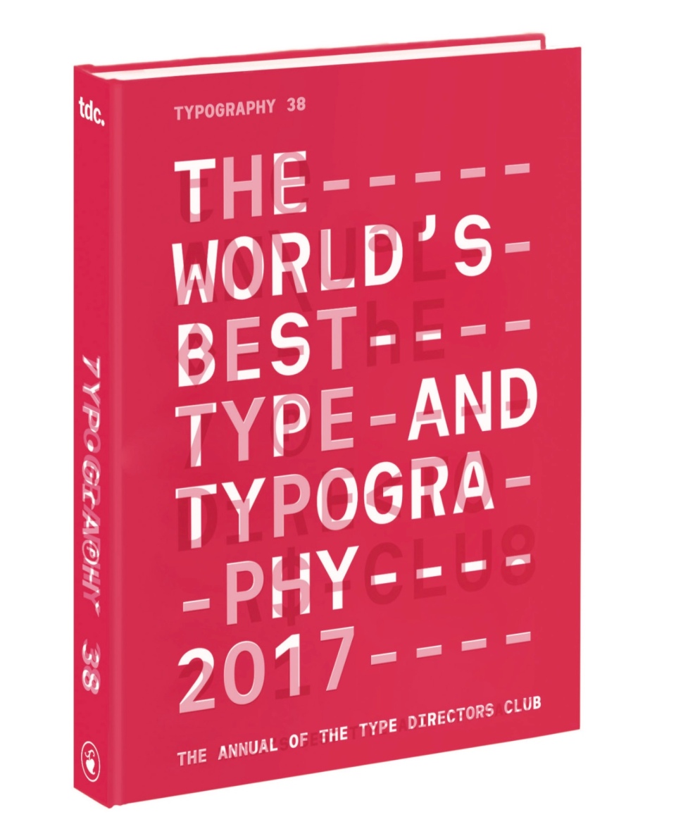
One of my singular pleasures of the year is when I receive my Type Directors Club annual in the mail. I’ve been a member since 2010 – one of the benefits of memberships of course is that you receive the beautiful Type Directors Annual each year, which, in my humble opinion, is the best curated collection of design examples from around the world year after year. Membership in the Type Directors club offers a lot more than just the annual though. It’s a way to connect and interact with the world’s very best designers, creative directors and typographers – and of course, if you work is up to standard, a way to present your very best work in front a very distinguished audience (Adelaide firms Voice and Studio Band were both awarded in the latest Type Directors awards for example (well done guys!) I thought I would share some of my favourite pieces from the latest annual, I’ll think you’ll agree it’s some cracking work.
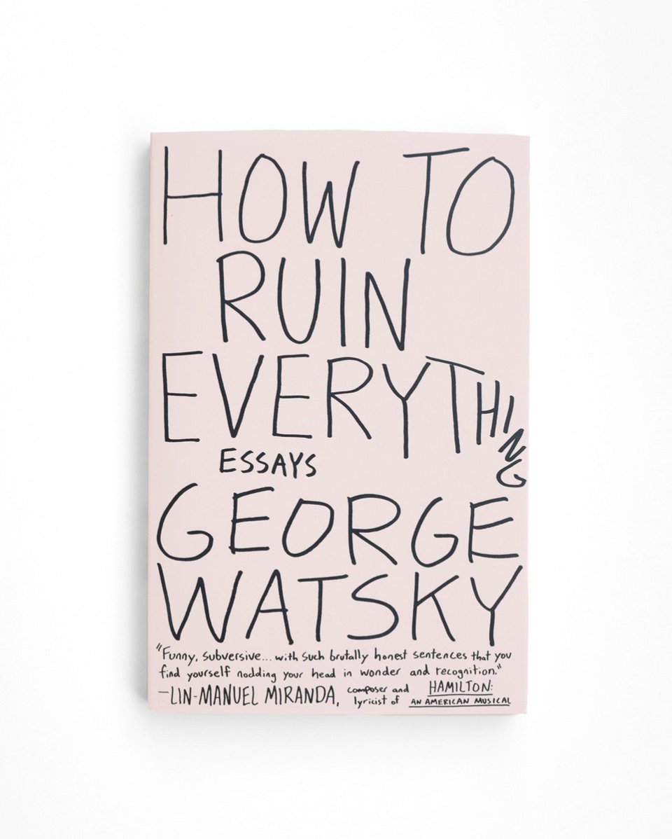
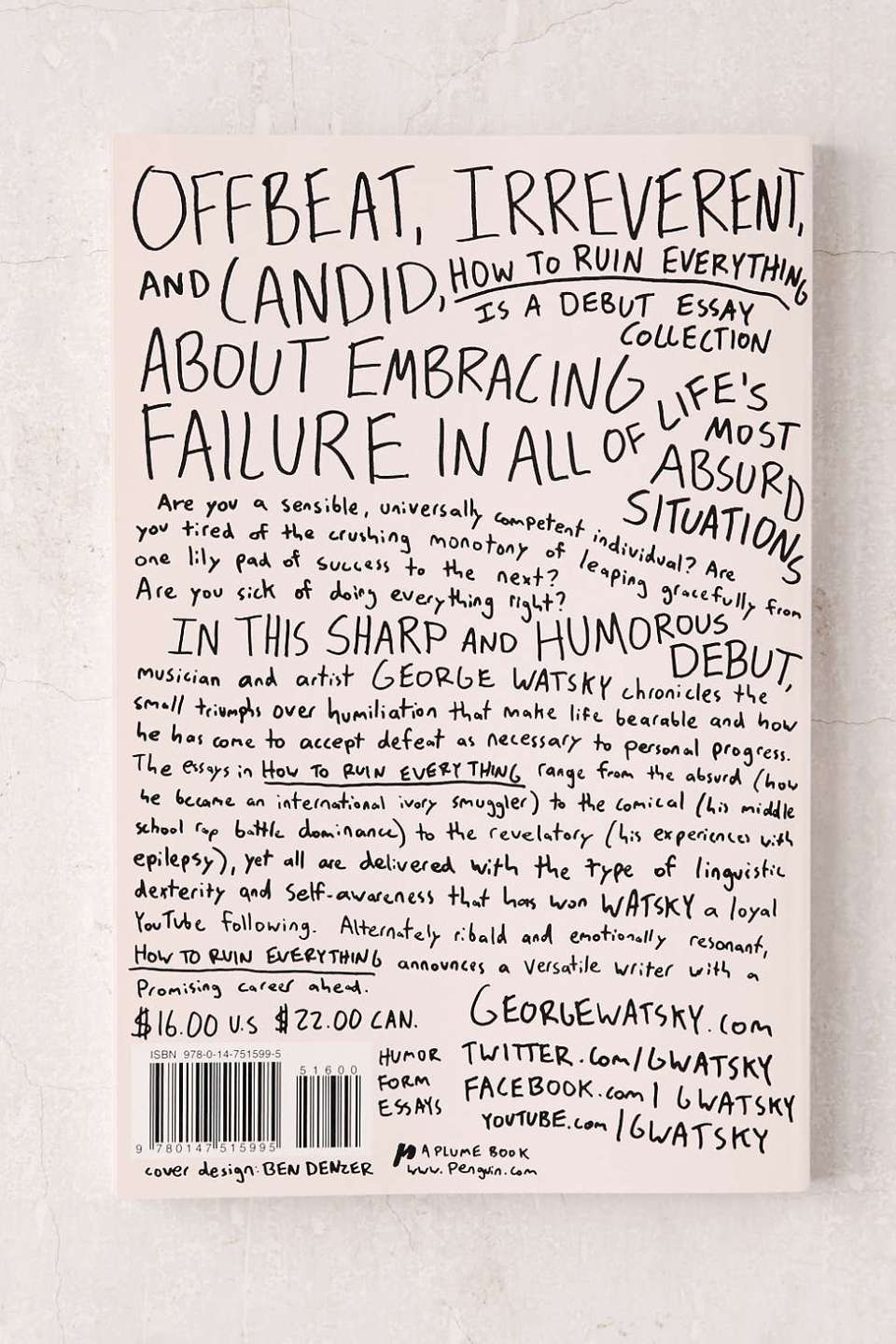
How to Ruin Everything: Essays By George Watsky
Design Ben Denzer Art Direction Jason Booher
I thought I would start off with what is probably my very favourite pieces in the whole annual. I wish I could spend my life designing book covers that look as care-free as this.
Just when you admire how beautiful the cover is, you then turn it over to see that the back cover may be even better. I remember being so knocked out by this when I saw it on the bookstore shelf that I immediately had to have it, just so I could admire that cover at leisure. Luckily for me that it is also an awesome collection of essays written by the very clever and very funny George Watsky – perfectly encapsulated in that cover.
Make sure you check out Ben’s site for some more of his awesome work.
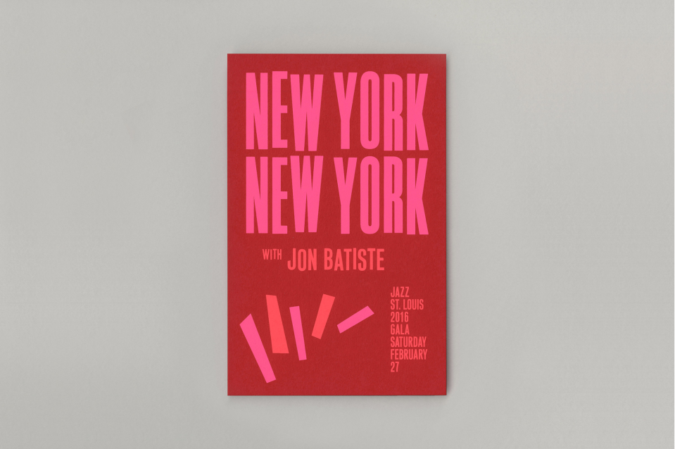
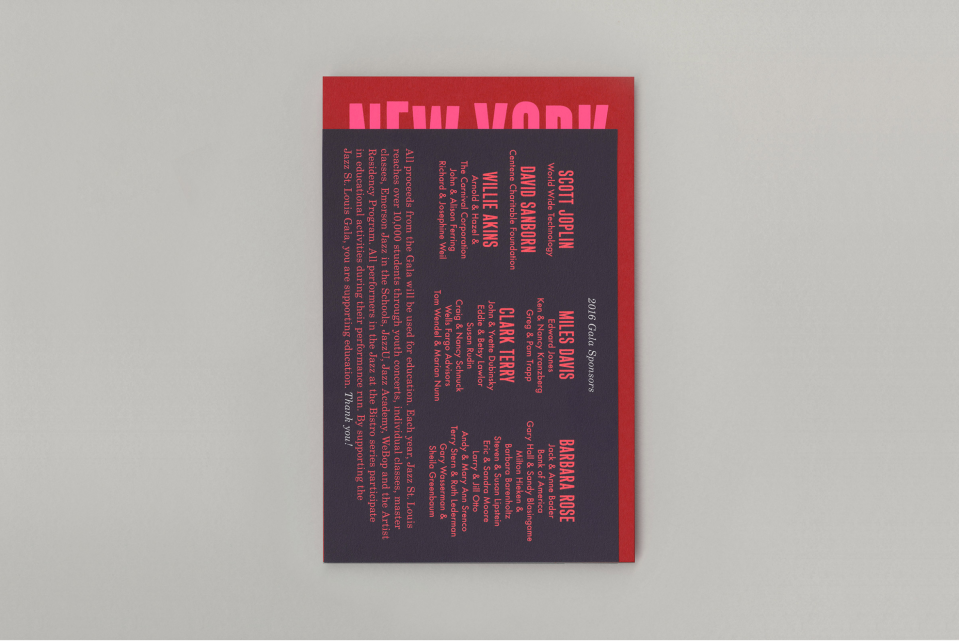
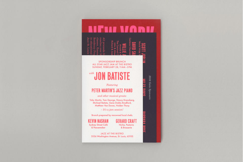
Jazz St. Louis Gala Invitation
Design Direction Sarah Newitt
Design Kiku Obata & Company
I really like how this invitation uses the vernacular of mid-century jazz album typography but modernises it with a contemporary typestyle update and the use of a modern neon colour palette. It’s sophistication is totally appropriate for its intended audience. I would want to go to this if I received it in the mail.
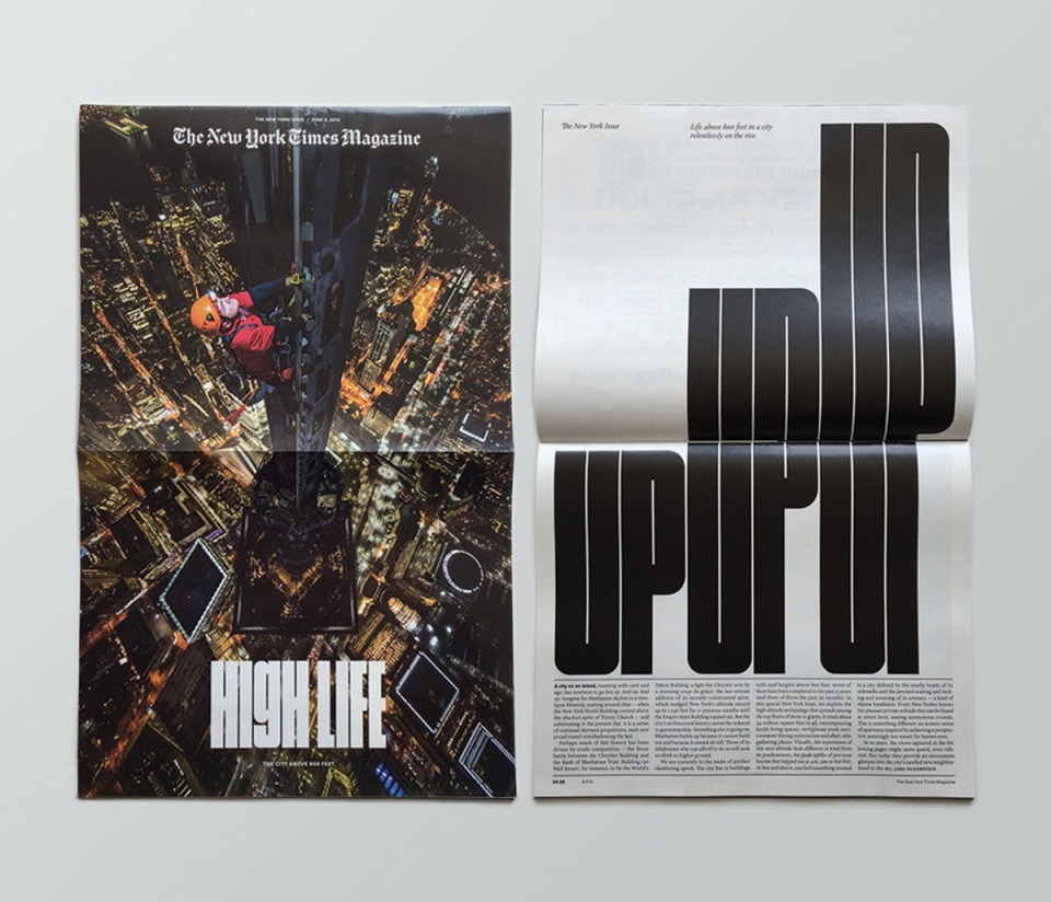
The New York Times Magazine
Design Frank Augugliario, Ben Grandgenett, Chloe Scheffe, Matt Willey
Design Director Gail Bichler
Art Direction Matt Willey
Deputy Art Director Jason Sfetko
The New York Times Magazine produces the goods week after week, displaying the very best publication design you can imagine. Gail Bichler and Matt Willey are two of my design heroes with what they are able to achieve with the NYT Magazine and a constant inspiration upon my own work. This issue turned it up a notch by turning the whole magazine 90 degrees as a play upon the issues subject matter: Life above 800 feet. Every detail is considered, down to a custom typeface to fit the heights of the new dimension. Keep in mind these guys are doing this sort of work on a weekly basis, check out the Winter Olympics issue they produced recently as another beautiful example of publication design going the extra mile.
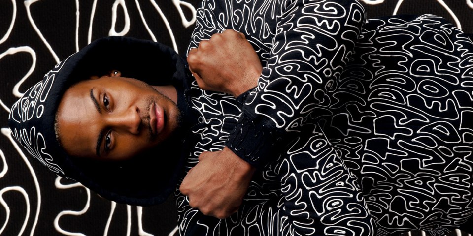
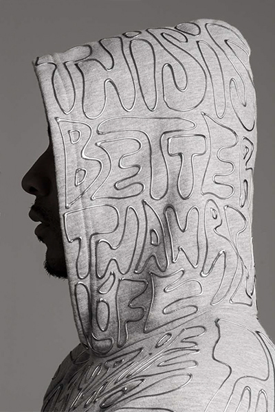
Just Another Unicorn Hoodies
Creative Direction and Calligraphy Mariana Castellanos
Most streetwear you see around the place these days is about as cool as something your grandmother would give you for Christmas – and most graffiti inspired designs are about as wearable these days has a hyper-colour t-shirt. These are something else though, tangible subtle lettering on muted colour backgrounds, they are a typography buffs dream attire. While ultimately they are ‘too rad’ for someone like me to wear, I could imagine someone cool like Chris Cooper or Nic Eldridge could pull it off.
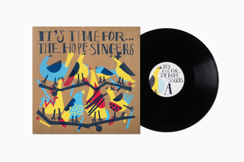
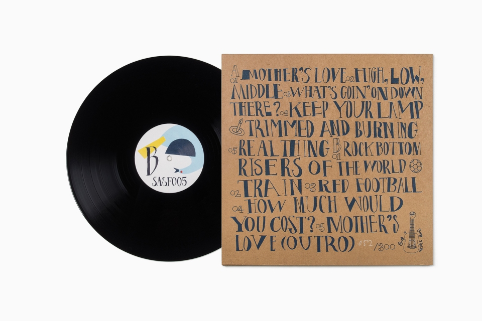
It’s Time For The Hope Singers LP
Design Mattias Amnäs, Anders Bollman, Fibi Kung
Creative Direction Perniclas Bedow
Calligrapher & Illustrator Fibi Kung
Design Firm Bedow
I’d seen this online a few months back and admired it, so I was as happy as could be to see that it was featured in the latest typography annual. It does this old heart good to see such considered typography used so well on an LP cover! Unfortunately by the looks of it, with a run of only 300, I’m imagining it’s not the easier of records to actually get a physical copy of.
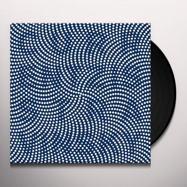
Stravinsky LP
Design Fons Hickmann, Lizzy Onck
Studio Fons Hickmann m23
Ok, squint your eyes a little bit. See it? Pretty clever play on the traditional Op Art technique. It’s the sort of music that is ripe for such interesting interpretation, but seldom is, which lets this particular design sit well apart from the pack.
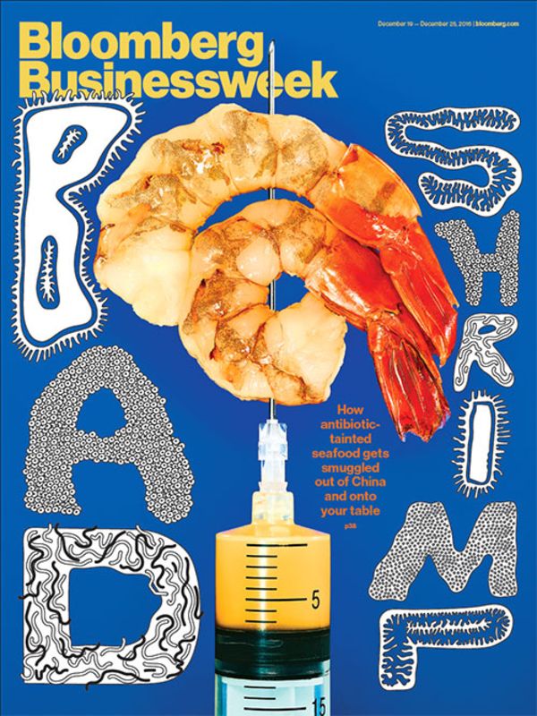
Bloomberg Businessweek Magazine
Design Simon Abranowicz
Creative Direction Robert Vagas
I’m not particularly concerned by the machinations of the business world on a weekly basis, but luckily I am enamoured by great design and typography, which must be the reason I’m quite often picking up copies of Bloomberg Businessweek. This cover is a real standout for a magazine that prides itself on producing stand-out covers. Bold, weird and king of icky at the same time – you wouldn’t think the subject matter would particularly lend it self to such an original presentation. But here we are, with Bloomberg Businessweek securing it’s regular berth in an edition of the Typography Annual. And the design inside is just as good.
So that’s just a brief overview of some of the gems waiting to be discovered in the latest Type Directors Annual (these ones I featured weren’t even selected as judges choices, so there is still a bounty of typographic excellence to be discovered. I will also urge you, if you have the means, to become a member of the Type Directors Club yourself if you are not already – personally I think it’s a small price to pay to be in the company of such extraordinary work – not to mention the designers and typographers behind it.
