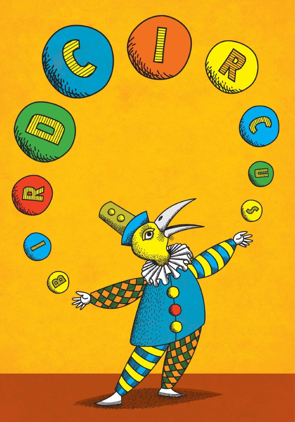
Bird Circus (formerly Bus Design Studio), is a creative studio formed by designers, illustrators and birdwatchers Amanda and Eden Cartwright. I’ve know Eden for a long time, having shared primary schools, high schools and University – we even lived in the same suburb until my recent move, you could say I’ve been an admirer of his work for a long time! Eden and Amanda, needless to say, have a plethora of beautiful design and illustration pieces on the Bird Circus website – along with some great photos of their studio space, very jealous. I also have to say, Bird Circus is a great studio name as well, Eden and Amanda sent me some beautiful printed promotional pieces to introduce the new name, (see above), the site itself is very well designed – I love the fun little animations they have going on. Check out their instagram account as well, worth it for the pic of old SA ice cream tins!
Category Archives: graphic design
AGDA Awards 2016 Reviewed!
So there were some Australian Graphic Design Association awards announced a couple of weeks ago, I hear the ceremony was even held in my home town of Adelaide (I had a previous engagement booked that evening ;). That doesn’t stop me from coming in late to the party and casting my critical eye over the results though, if not me, who will though?
All joking aside, it looks like it was a pretty good evening, and as usual, some deserving work was recognised. It’s a tough job holding design awards these days it seems, even great design institutions of my youth like the Communication Arts Design Annual seem a little lacklustre these days. I guess design awards have lost a bit of their sting and surprise when nowadays everyone can stick their work online for instant appreciation. I wonder if younger designers put much stock in the whole idea of design awards these days. Looking at the entries for the AGDA Awards, there are certainly a prevalence of a lot of the well known names, also some glaring omissions that questions whether even established studios have much interest in design competitions these days. Are they too expensive to enter? Is an annual event too often? Or do design firms just not see any relevance in it for themselves? These are questions probably best left for another post (indeed, maybe questions that need to be posed about the organisation of AGDA itself in some regards, but in the meantime, let’s take a look at what got the gongs this year, and what, in my humble opinion, should have perhaps received a little more recognition.
IDENTITY
Pinnacle winner: Frost* Collective Paper #5

| Designer | Chris Griffiths |
|---|---|
| Creative Director | Vince Frost |
| Art Director | Anthony Donovan |
| Typographer | Anthony Donovan, Chris Griffiths |
| Writer | Sophia Watson |
| Photographer | Brett Boardman, Tyrone Branigan, Nicole England, Tom Ferguson, Murray Fredericks, Anthony Geernaert, Tim Jones, Mark Neusham, Zahn Pithers, Sooti Tan |
| Other | Producer, Miya Bradley Editor – Sophia Watson |
| Paper | Spicers |
| Printer | Ligare Book Printers |
Finally this year, a winner in the Identity category, but I’m not all that sure about this pick. Don’t get me wrong, Frost do excellent work, and this is an excellent piece of work, but does it fit into the category of Identity? Isn’t it more a publication or self-promotion? (I wish the awards had this category). It seems weird that after a couple of years of having no pinnacle winner under identity that this gets the gong, I guess it’s as broad as you want it to be.
Should have been a contender… Brewster Murray Corp. Identity by Frost* Collective

| Designer | Ryan Curtis, Louis Johanson |
|---|---|
| Creative Director | Anthony Donovan |
| Other | Project Manager – Simon Wales Strategist – Jeanne Ogilvie Strategy Director – Cat Burgess |
To be honest, there wasn’t much in the Identity category that particularly stood out to me this year, but this entry by Frost* did appeal to my love of old school aesthetics. You don’t see the old ‘letter-mark’ logo in use so much these days, but I think it works very well here and brought a smile to my face and a nod of appreciation for its swiss style utility. Massimo Vignelli would approve I’m sure!
Should have been a contender… My Kingdom For a Horse Corp. Identity by Parallax

| Designer | Kellie Campbell-Illingworth |
|---|---|
| Art Director | Kellie Campbell-Illingworth |
| Finished Artist | Kellie Campbell-Illingworth, Josh Jarvis |
| Printer | Digiwedoo |
Full Marks to the guys at Parallax for designing an identity for a cafe called ‘My Kingdom For a Horse’ and not actually using any representation of a horse in it. I would have used a horse. That’s why they are winning awards and I’m just commenting on awards. Beautiful work though, and a very nice cafe to visit if you are ever in the vicinity.
Pinnacle winner: 20th Biennale of Sydney Guidebook by For The People

| Designer | Jason Little, Olivia King, Lauren Barber |
|---|---|
| Creative Director | Jason Little |
| Typographer | Jason Little, Olivia King, Mathieu Reguer |
| Finished Artist | Lauren Barber |
| Illustrator | Ben Walker |
It’s a handsome piece, from what I can tell, I imagine it’s pretty impressive when in hand. The ‘Print’ category is such a weird all encompassing sort of beast, it’s really hard to judge what is appropriate or not. Should this be under publications? I don’t know, it seems a handsome piece, so I’ll trust the jurors choice in this case.
Should have been a contender… Supercoach campaign by Cornwell

| Designer | Adit Wardhana |
|---|---|
| Creative Director | Quan Payne |
| Typographer | Adit Wardhana |
Well this is something you don’t see everyday in your design awards, effectively, a newspaper advert. Really well considered for its intended audience, but still manages to keep its ‘designer cred’. I think it probably deserved a distinction recognition for meeting the needs of the intended audience and still keeping its aesthetic soul. Not an easy thing to achieve.
Should have been a contender… Synthia Campaign by Christopher Doyle and Co

| Designer | Christopher Doyle |
|---|---|
| Creative Director | Christopher Doyle |
| Art Director | Christopher Doyle |
| Typographer | Christopher Doyle |
| Photographer | Pierre Toussaint |
I like album cover design, I like black and white album covers, I like Chris’s work. I think this is a beautiful piece of design in a field (album cover design) that seems to be fading fast unfortunately. That’s also some fine photography right there.
PUBLICATIONS
Pinnacle Winner: The Greedy Hand + The Gentle Eye: An Everyday Baroque Practice In Architecture by Catherine Griffiths
Pinnacle Winner: Gary Heery Bird Book by Alphabet Studio

| Designer | Catherine Griffiths |
|---|---|
| Typographer | Catherine Griffiths |
| Other | Dr Rachel Hurst, Author |
| Paper | Mohawk, Flying Colours, Gilclear, Chromolux, via BJ Ball Papers |
| Printer | Press Print Limited, Bookbinding Press |

| Designer | Tim Kliendiest, Paul Clark |
|---|
Wow, the jurors really went to town with this category, two pinnacle winners! Both pieces are just dandy, look beautiful and I’m sure are very deserving winners, i’d love to own them. But this category drives me crazy. You’ve got books magazines, Annual reports, even a digital piece in the finalists. Does it seem fair to stack those pieces up against such beautifully produced books? What distinguishes this category from Print really? I also get the feeling that the category maybe doesn’t receive a lot of entries which is unfortunate, there seems to be a lot of nice ‘published’ stuff out there, though book designers do have their own awards competition in this country as well I recently discovered 😉
Should have been a contender… Krass Journal #2 by Frame creative

| Designer | Simon Pearce |
|---|---|
| Creative Director | Simon Pearce |
| Art Director | Simon Pearce |
| Typographer | Simon Pearce |
| Finished Artist | Simon Pearce |
| Photographer | Sam Pearce |
| Printer | New Style Print |
I’m really disappointed that for a second year in a row, Krass Journal wasn’t awarded a higher ranking. It’s a beautiful and uniquely designed magazine with an individual point a view which is really pushing the boundaries of content and design, I really feel this is the sort of work that should be receiving greater recognition and to see it overlooked again surprises me. Maybe better luck next year?
PACKAGING
Pinnacle winner: The Old Bloke & Three Young Blondes by Voice

| Designer | Kieran Wallis |
|---|---|
| Creative Director | Anthony De Leo, Scott Carslake |
| Typographer | Kieran Wallis |
| Finished Artist | Kieran Wallis |
| Writer | Tash Stoodley |
| Illustrator | Kieran Wallis |
| Printer | Collotype and Glassprint |
Well, no arguments here from me! A deserved winner of the highest honour and it’s finally nice to see something crack what seemed an impassable barrier to score a packaging pinnacle. The work Voice have produced for the D’Arenberg brand has been consistently impressive, and this labelling is perhaps the ‘pinnacle’ of that work (see what I did there? 😉
Should have been a contender… 36 Short by Studio Band

| Designer | Chris Cooper, George Randle |
|---|---|
| Creative Director | Chris Cooper |
| Art Director | Chris Cooper |
| Typographer | Chris Cooper |
Sad to see this didn’t receive a higher gong, I really love the simplicity and instant impact of these labels, they really stand out in a busy market and the typography is beautifully considered and non-fussy without just being a ‘swiss-style’ template.
Should have been a contender… Artis Clear Valley Riesling by Todd Engelsma

| Designer | Todd Engelsma |
|---|---|
| Creative Director | Todd Engelsma |
| Illustrator | Todd Engelsma |
| Printer | Impresstik Labels |
I love this label by Todd Engelsma as well because it doesn’t look like any of the other wine label finalists. It features some beautiful illustration and the typography is subtle with a quirky edge to it.
Should have been a contender… Palmetto Wine Co by Frame Creative

| Designer | Simon Pearce, Sam Pearce |
|---|---|
| Creative Director | Simon Pearce |
| Art Director | Sam Pearce |
| Typographer | Simon Pearce |
| Finished Artist | Simon Pearce |
| Writer | Simon Pearce |
| Photographer | Sam Pearce |
| Printer | MCC |
These range of labels from Frame Creative again offer something different from the usual look. There’s some very impressive typography at play here and that Palmetto word-mark is just awesome. Beautiful use of colour palettes across the whole range as well.
DIGITAL
Pinnacle winner: Streamtime app by For The People

| Designer | Johanna Roca, Melissa Baillache, Sam McGuinness, Jason Little |
|---|---|
| Creative Director | Jason Little |
| Art Director | Johanna Roca |
| Writer | Mat Groome |
| Illustrator | Ben Walker |
| Other | Andy Wright, Director Damian Borchok, Director Aaron Green, Founder – Pius Jeon, Developer – Kevin Liu, Developer – Alan Whitby,Developer – Jonathan Gregory, UX |
Ok, I’ve had a pretty good look at this app, seems like a good option for a studio management system, with the right amount of designer looking cool to make you feel like you’re not doing boring admin stuff – I find the writing style in it a little annoying though, I’m sure it works fine for the cool kids.
Should have been a contender… The Practical Man website by Sons & Co

| Designer | Matthew Arnold, Greg Brown |
|---|---|
| Creative Director | Timothy Kelleher |
| Other | Garbett |
There weren’t a lot of pieces in the digital section where a consumer would have to actually use it to view and purchase items. The Practical Man website really stands out as both an aesthetically pleasing visual experience as well as an easy to navigate systems to spruik the wares across various devices.
MOTION
Pinnacle winner: The Innovator animation by Buck

| Designer | Lucas Brooking, Josh Edwards, Mathijs Luijten, Colin Bigelow, Elijah Akouri, Gareth O’Brien, Matisse Gonzalez |
|---|---|
| Creative Director | Gareth O’Brien |
| Art Director | Lucas Brooking |
| Other | Audio House – Antfood Executive Producer – Erica Ford |
This is pretty good I guess, kind of hard for me to gauge, it looks quite Aardman-esque, which is never a bad thing!
Should have been a contender… 2016 Adelaide Cabaret Festival by Culdesac

| Designer | Kathryn Sproul |
|---|---|
| Creative Director | Marco Cicchianni |
| Art Director | James Parker |
| Photographer | Randy Larcombe |
| Other | Marco Cicchianni, Director Ali McGregor, Artistic Director Nicola Tate, Producer |
I love a clever typographic solution, and this one is beautifully crafted as a moving brand expression of the festival itself. Everything about it is just right and it pulls it off without being overtly cliche as these things can sometimes descend into when they try too hard.
One of my favourite design pieces of the year.
SPATIAL
Pinnacle winner: Pop Marble Run by Alt Group

| Designer | Dean Poole, Dean Murray, Aaron Edwards, Adam Ben-Dror, Clark Bardsley |
|---|---|
| Creative Director | Dean Poole |
| Other | SJD, Musical Composer Design 360 |
Well, this is different and quite interesting when you read up about what it actually is (I’d encourage you to look up more info on the web). This is the kind of work that expands the boundaries of what we define as ‘graphic design’ and I’m pleased it’s been awarded accordingly, of course it’s by Alt Group!
Should have been a contender…. Vic’s Meats Office Fitout by End of Work

| Designer | End of Work with Those Architects |
|---|---|
| Creative Director | End of Work |
There wasn’t a lot in the spatial category that really blew me away this year other than the obvious Pinnacle winner above. I did like this fitout for Vic’s Meats demonstrating a very ‘against expectations’ subtle and beautiful approach to their office graphics though.
DESIGN CRAFTS
No Pinnacle winner
This is a tough category to crack (let alone decipher what it really encompasses) Not too much that caught my eye other than the photography for the Synthia album cover and The Adelaide Cabaret Festival typography, both of which I have mentioned before.
DESIGN FOR GOOD
No Pinnacle Winner
These last two categories I really have travel getting my head around, I sort of get where they trying to come from with the ‘Design For Good’ category, but I just can’t help thinking that all design is produced with ‘good’ in mind – this category tries to judge a designs merit on its particular ‘social agenda’ – very hard to judge on just looking at it’s visual impression rather than it’s impact (and how do you gauge that anyway?)
Should have been a contender… Thankyou Track Your Impact by Yump

| Designer | Yuan Wang, Holly Bartholomeusz |
|---|---|
| Creative Director | Yuan Wang |
| Other | Simon East, Technical Director Brian Truax, Digital Producer Wei Lin, Developer |
This isn’t any great design revelation, but I can appreciate its usefulness in being able to view where your donation goes and I can imagine it is also a useful as a fundraising device in that regard, it does what it does without bells and whistles.
DESIGN EffECTIVENESS
No Pinnacle Winner
See above category for my opinions on this. I really don’t know the criteria this is judged on, so can’t offer any more comment than ‘I really don’t understand why the category is included’.
So there you have, as always, feel free to leave any comments on your own views of the awards and the winners, I’d love to hear them. Don’t forget to go and look at the full list of finalists at the AGDA Awards site.
Designers Who Are Better Than Me

Toolbox, those purveyors of great design and awesome studio environs have updated their website with a new look and of course, lots of really nice design work. With an enviable client list and a sideline in gin production – proprietor Adam and his team are keeping busy and producing the goods. And seriously, you really need to try their gin if you have the means, you will not be disappointed (great label design as well, obviously).
Designers Who Are Better Than Me

Frank Aloi is a designer who has been working around the traps for a little while now, and is doing some excellent work, particularly in the field of packaging and identity design. He’s updated his site with a new look and some beautiful new work since I last had a look, so now is as good a time as any to give him a shout-out and encourage you to take a gander at some very inspiring design pieces.
Cornershop Looking For Mid-Level Designer

One of Adelaide’s very best design establishments is looking for a mid-level designer. Damian at Cornershop has an amazing pedigree of excellent design work and is a consummate gentleman and creative tour de force. This is one of those once in a blue moon opportunities to work for a studio that is genuinely forward looking, award winning and boundary pushing. It also has the added bonus of also sharing your surrounds at Cornershop with those other tenants that form the ‘quantum of awesomeness’ on East Terrace, Adelaide, design mavens Mash, Working Images and sector7g. Living interstate? This is definitely a job worth moving south for! Check out the details here if you think you can make the grade.
Seen & Liked


I’m loving the understated beauty of this design for 36 Short, which is a type of Balkan spirit called Rakia. It is designed by the guys at Studio Band and I spoke to Creative Director Chris Cooper, about what went into the creation of the label design:
“We were approached by two brothers, Jon and Con Lioulios. The brothers were extremely passionate about taking their late fathers Rakia recipe, that had been passed down through their family for generations, from a tiny non commercial still operating in their shed to a brand and product that introduced the widely unknown spirit to the rapidly growing boutique, small batch spirits industry. After several weeks of research we wanted to develop a brand that removed itself from tradition and convention to allow the product to become more palatable and engaging to a relatively broad audience. Being that 36 Short was somewhat of a contemporary take on an age old recipe we felt it was extremely important to create a brand that reflected that, we wanted to avoid the trap of creating a brand that looked like it was designed for a different era, it needed to be honest. 36 Short is currently being launched to the public with huge interest, not only locally but also nationally and it is quickly becoming a stand out product within a highly competitive market.
So mission accomplished! And for all you type nerds out there, the sans font used is
Walsheim Bold from Grilli Type and the monotype font on the front and back label is Apercu Mono from Colophon, both excellent type foundaries. Studio Band are about to launch an update to their website, so keep an eye out for that in the not too distant future (in the meantime, there’s already some great work to look at on their current site). And if you want more information on 36 Short itself, there will me an extensive post on the product and producers on The Source, Adelaide food and wine website in the next day or so.
Designers Who Are Better Than Me

In the tradition of great local designers with the first name ‘Chris’ we have Chris Harris and his wonderful design studio, Draw. It looks like Draw have recently moved based to the oh so trendy environs of Peel Street in the city, so what better time to draw (sic) your attention to the fine work that is being produced therein. Above is one of my favourite design pieces of the last year or so for Ponder Posy, which was a finalist in the AGDA design awards last year (though as I mentioned in my post on said awards, in my humble opinion it should have scored a bit higher). There’s lots of other great work to peruse on their site, so go and take a look and be duly impressed as I was.
AGDA Awards Winners announced!
Hey, I hear there were some of those graphic design awards handed out in Sydney on the weekend – the pointiest awards in the country (other than the Arias, obviously. The Australian Graphic Design Association Awards are now an annual event, and as usual the field was tough and the top gongs, the aptly named ‘Pinnacle’ were hard to come by. So let’s take a (somewhat) biased view through the winners by category, and also take a look at some of the finalists that (again, in my humble opinion) may have been hard done by in not picking up the higher honour of a Distinction or Pinnacle. Be warned, there is some humbling, awesome work ahead.
BRANDING
No Pinnacles awarded. (Same as last year)
Judges were tough on the branding category with none of the ten distinction winners able to step into the top gong, it’s a pretty difficult category to get the complete scope of a particular piece of work across though.
Should have been a contender…….

| Designer | Scott Carslake, Anthony De Leo |
|---|---|
| Creative Director | Scott Carslake, Anthony De Leo |
| Art Director | Scott Carslake |
| Typographer | Scott Carslake, Anthony De Leo |
| Finished Artist | Scott Carslake, Anthony De Leo, DesignLab |
| Writer | Adelaide Festival of Arts |
| Photographer | Various |
| Illustrator | Scott Carslake |
| Paper | Various |
| Printer | Print Solutions |
I think Voice were unlucky not to be recognised for their beautiful interpretation of the 2015 Adelaide Festival of Arts. This is a huge undertaking, and all the elements slot in perfectly and are pushed and pulled into some remarkable solutions to some complex communication tasks. Maybe the jury were put off awarding to an Arts Festival (and maybe you had to be here to experience it all).

| Designer | Eva Dijkstra |
|---|---|
| Creative Director | Eva Dijkstra |
| Art Director | Eva Dijkstra |
| Typographer | Eva Dijkstra |
| Finished Artist | Eva Dijkstra |
| Paper | mixed letterpress and foil stamping |
| Printer | Watermarx Graphics |
I love this ‘one colourish’ branding solution for Courtesy of the Artist by design firm Toko. Simple, modern and elegant.
GRAPHIC DESIGN
Pinnacle winner: Whitlam Place by Studio Hi Ho

| Designer | Patrick Scanlan, Wes Waddell, Dale Bordin |
|---|---|
| Writer | Elizabeth Kulas, Michael White, Mark Rubbo OAM, Marcello Donati |
| Photographer | Mark Strizic (1928-2012), Leslie H Runting, Wolfgang Sievers (1913-2007), Morgan Hickinbotham |
| Illustrator | Gatsby |
| Other | Gabriel Saunders, Renders |
| Paper | Colour Plan (Citrine, Real Grey, Forrest), Cyclus Offset, A2 Silk |
| Printer | Bambra Press, Avon Graphics |
Well, I don’t have a lot to go on from the example provided above, and haven’t been able to source any more material online. I’m guessing it’s awesome in the flesh to be awarded the highest honour. ‘Graphic Design’ is such an all encompassing category title, so it’s a tough job to be a contender I imagine.
Should have been a contender…….

| Designer | Chris Harris, Ellen Beames |
|---|---|
| Typographer | Chris Harris |
| Photographer | Anna Fenech |
| Paper | BJ Ball – Colorplan. |
| Printer | Hunter Brothers |
Really surprised that Chris at Draw Studio didn’t receive at least a Distinction for this clever stationery for Ponder Posy, real ‘out of the box’ solutions deserve to be awarded and this definitely ticks that box. One of my favourite pieces of design work I’ve seen from anywhere this year.

| Designer | Jason Little, Olivia King |
|---|---|
| Creative Director | Jason Little |
| Typographer | Olivia King |
Unfortunate also, is this little piece of design brilliance that missed out. Again, I am a sucker for simple one colour, no nonsense small business design solutions, the letterpress is just icing on the cake. Well done Jason and Olivia from design studio For The People, I’m sure client Tim Jones was chuffed.
MAGAZINE & NEWSPAPERS
No Pinnacles awarded. (Same as last year)
Obviously a tough nut to crack, as this category had the least finalists, still, there was at least one that should have been recognised I feel.
Should have been a contender…….


| Designer | Simon Pearce |
|---|---|
| Creative Director | Simon Pearce |
| Art Director | Simon Pearce |
| Typographer | Simon Pearce |
| Finished Artist | Simon Pearce |
| Writer | Tess Martin & Sanja Grozdanic |
| Photographer | Sam Pearce |
| Illustrator | Simon Pearce |
Maybe I’m the teensiest bit perocial over this new Adelaide magazine, but Krass by Frame Creative was one of the best new magazines to come on the market anywhere in the world this year, (and I’m not just talking in a design context, but also in terms of content). Considering the amount of online buzz the mag has been generating, I think it probably deserved at least a Distinction placing, but it’s early days, and with a couple of more issues under their belt, I’m sure it will be a serious contender in next years awards.
Books
Pinnacle winner: Mongrel Rapture by Stuart Geddes & ARM Architecture


| Designer | Stuart Geddes and ARM Architecture |
|---|---|
| Typographer | Stuart Geddes |
| Finished Artist | Stuart Geddes |
| Writer | Various |
| Photographer | Various |
| Other | Editors: Mark Raggatt and Maitiú Ward |
| Paper | Various |
| Printer | Amity Printing Company |
That is one heaping slab of a book! Kudos to the time and effort put into such a magnificent feat of design!
Should have been a contender…….

| Designer | Vince Frost, Adam Vella |
|---|---|
| Creative Director | Vince Frost |
| Writer | Denis Seguin |
| Other | Miya Bradley, Producer |
| Printer | Penguin Books Australia |
While probably no great shakes in pushing the boundaries of book design, nevertheless, I think Vince Frost’s Design Your Life deserves recognition for pushing design principles onto a mainstream audience, I really enjoyed reading it as well, I wonder how much of the actual content of a piece is taken into consideration by the judges. How do you judge the effectiveness of a books design for example, if you haven’t read the book. And for that matter, how about the effectiveness of the design of a wine label if you haven’t tasted the wine?
PACKAGING
No Pinnacles awarded. (Same as last year)
Wow, talk about your tough categories, if Alt Group’s ‘Egg Nog’ bottle couldn’t crack a pinnacle last year, or Mash’s labels for Alpha Box & Dice in 2012, it would have to be something extraordinary to make the grade this year, speaking of which…
Should have been a contender…….

| Designer | Scott Burns |
|---|---|
| Creative Director | Michael Lugmayr, Eva Dijkstra |
| Other | Production, Scott Burns |
This is the biggest surprise to me, as I would have picked this as best in show easily. In case you’re not sure what you’re looking at here, this design by Toko, are for book sleeves for the photographic portfolio of Juliet Taylor. They are handmade and individually poured using two tones of coloured resin that reflect the colour pallet of Juliet’s photographs. Beautiful, appropriate and unique, I’m not sure why they missed out on a Pinnacle, but there you go. I wonder if they may have scored better in another category like books or design craft, rather than the crowded packaging field? That’s one of the problems of The AGDA awards, picking where to place your work, I guess you could put it in multiple categories, but it’s not exactly cheap to take that gamble.

| Designer | The Hungry Workshop |
|---|---|
| Paper | Simcote, Beer Matt Board & Kraft Cardboard |
| Printer | The Hungry Workshop |
Yes, I know, it’s another one colour-ish, minimal letterpress design, but isn’t it beautiful? The Hungry Workshop do good work obviously, but they’ve really come up with a winning solution here, I’m not sure what Khloris Botanical Skin Tonic does, but now I want some!
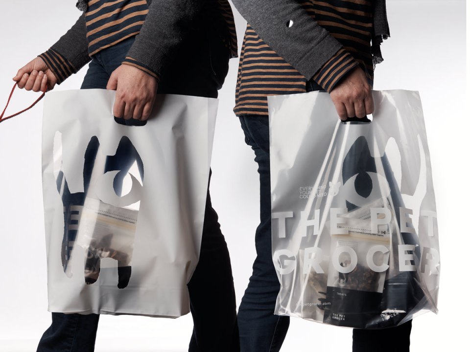

| Designer | Andrew Ashton |
|---|---|
| Creative Director | Andrew Ashton |
| Typographer | Andrew Ashton |
| Finished Artist | Andrew Ashton, Lucinda Vrzovski |
| Writer | Andrew Ashton |
| Illustrator | Andrew Ashton |
| Paper | KW Doggett |
| Printer | Gunn & Taylor, Convex NZ |
And speaking of one colour design jobs (again), Andrew Ashton is one of my design idols, so it’s hard for me to pass to pass this packaging range for The Pet Grocer up, and not feel compelled to grab my flaming torch and pitchfork and demand this be given a pinnacle. How cool are those cat and dog illos? And who thought a plastic bag for a ‘pet grocery’ could be so sexy?
Digital
Pinnacle winner: Christopher Ireland by Chris Halloran

| Designer | Chris Halloran |
|---|---|
| Photographer | Christopher Ireland |
| Other | Daniel Lever, Web Developer |
This is a case of static pictures not really telling the whole story of the site, it’s hard to go wrong designing a site when you have so many beautiful images to work with and a minimal design aesthetic. It’s actually pretty cool on the start up page how Christopher Ireland’s motion and photographic work are separated to emphasise both. I’m a bit torn on it though, I guess I really don’t know enough about the actual technical aspects, the mechanics of how the site was put together to really pass judgement on it.
Design Craft
Pinnacle winner: Financier typeface family by Klim Type Foundry

| Designer | Kris Sowersby |
|---|---|
| Creative Director | Kevin Wilson |
| Art Director | Mark Leeds |
I guess this is the category that typography, illustration and photography get lumped into now? Seems a pity that such separate disciplines have to fight it out together. Kris Sowersby’s typeface design is obviously well deserving of a pinnacle, though it makes me wonder why his extensive Domaine Family design only managed a distinction last year, despite being just as good (maybe even a little bit better?)
Pinnacle winner: Hither & Yon labels by Voice

| Designer | Anthony De Leo |
|---|---|
| Creative Director | Anthony De Leo, Scott Carslake |
| Art Director | Anthony De Leo |
| Typographer | Anthony De Leo |
| Finished Artist | Anthony De Leo |
| Illustrator | Chris Edser, Amanda Brown, Superexpresso, Anthony Foley, Zutto |
| Printer | Collotype |
Well, you’re not going to hear any arguments from me. I’m a long time enthusiast for the work coming out of the Voice studio (in Adelaide, of course!), and their designs for local South Australian winery Hither & Yon might be my favourite work of theirs. Beautiful, distinctive and fun, the wine is pretty good as well!
Should have been a contender…….
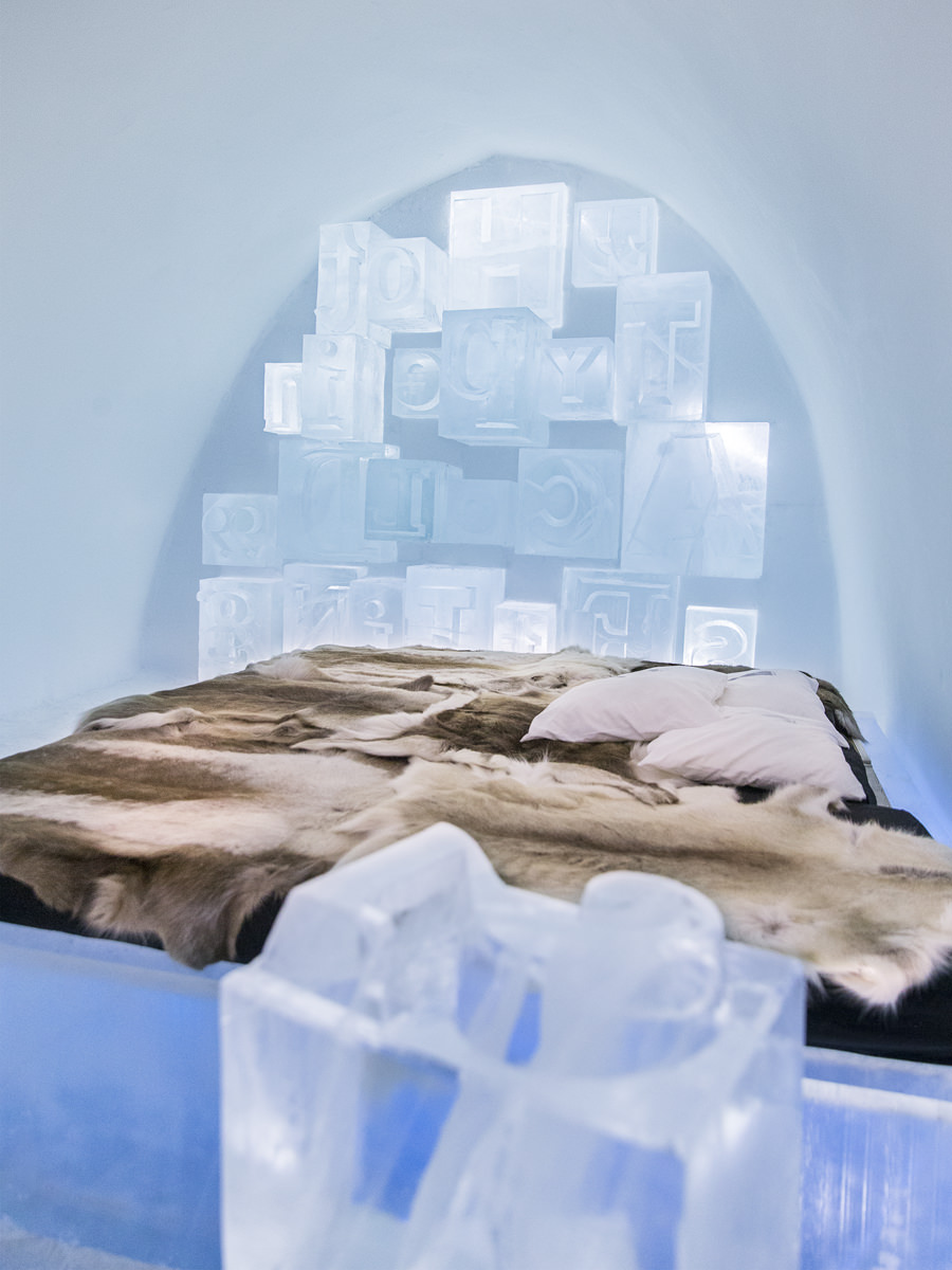
| Designer | Charli Kasselbäck, John Bark |
|---|---|
| Creative Director | John Bark (Bark Design AB) |
| Art Director | Charli Kasselbäck (ONE DAY Interact AB) |
| Typographer | John Bark, Charli Kasselbäck |
| Finished Artist | John Bark, Charli Kasselbäck |
| Other | Snow and Ice sculptors: Charli Kasselbäck, John Bark 3D-drafts and visualization: Karin Hedqvist. Photos: Paulina Holmgren, Cliff Karlsson, Printed material: Ilkopia, Work wear: Houdini Sportswear |
Well, this is kind of interesting. Hot Type in a Cold Setting seems to be a pretty unique
approach to in-situ typography. I wonder what it was all for? An exhibition of some sort? That’s some nicely carved ice right there though! I wonder why it didn’t rate a distinction? Maybe the judges were baffled as well?
Spatial Design
Pinnacle winner: Te Oro Tukutuku by Alt Group

| Designer | Dean Poole, Dean Murray, Aaron Edwards, Tyrone Ohia, Clarke Bardsley, Lorna Rikihana, Kelly Dixon, Bernie Papa, Tanya White, Tessa Harris, Huhana Turei, Te Rangitākuku Kaihoro, George Kahi |
|---|---|
| Creative Director | Dean Poole |
It seems like you can’t have an AGDA Awards these days without ALT Group picking up at least one pinnacle! I appreciate the handiwork that has gone into this piece of signage, but as far as its inclusion in the Spatial Design category, I sort of get the reaction of, is that it? Or is there more of the system we’re not seeing? Possibly better suited to the Design Craft category, it is a beautiful piece of work though.
Design For Good
No Pinnacles awarded. (Same as last year, see a pattern forming?)
I can’t really get my head around this category, for the good of what? Aren’t all the entries aiming to design for good? I don’t imagine any of them are designing for the sake of evil, though that might be kind of cool. Do they mean design for non-profits? Design for social causes? There seems to be a mixture of both and also commercial endeavours in the finalist mix. This and the following category always feel to me like the ‘justification awards’ – see, we’re not just judging on aesthetic taste! It smacks of an insecurity in the awards that really doesn’t need to be there. I kind of like the Haveyouseemycat.com site and it almost made my should have been a contender list, but it seems to have a confusing message over whether it wants to be a commercial enterprise or a civic service, in which case maybe the humour is a little misplaced. Losing your kitty is no laughing matter!
Design Effectiveness
Pinnacle winner: More Love For Nanna’s by Brand Society
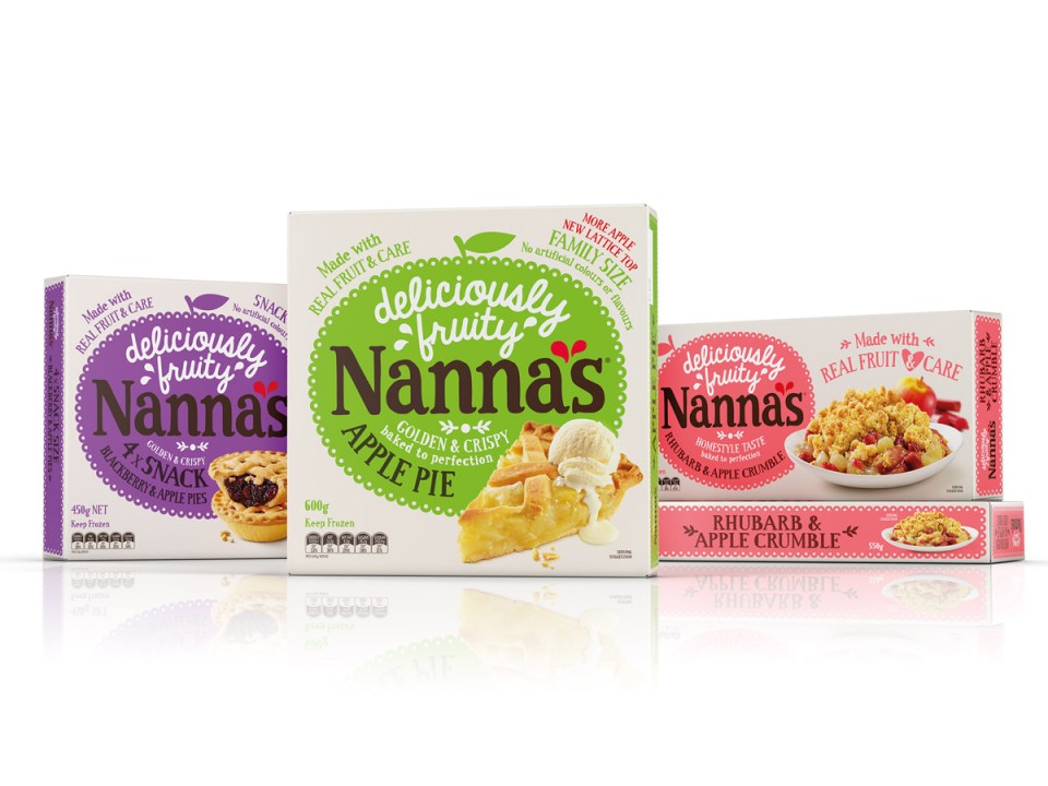
| Designer | Chris Wilson |
|---|---|
| Creative Director | Chris Wilson |
| Other | Nina Kelly, Strategic Director |
So I imagine this is judged on units sold after a redesign? All the finalist entries in each category are effective because they’ve won an award, right? It’s nice enough work and I’d pick them up in the supermarket if I saw them I imagine. I’m cool with the whole hand-drawn aesthetic and all, but my one bug-bear with this sort of thing is, actually hand draw the type and don’t use a font, or at least tweak the font so there are variations in the same letters (check the double n in Nannas to see what I mean) – especially if you’re winning a pinnacle! Nice colours though, just needed to push the design a little further, but that’s just the opinion of someone who has no pinnacles! 🙂
So there you go, another AGDA Awards done and dusted. Was the finalist list as good as the year before? Probably not, but then the previous awards had a two year scope to collect it’s batch of entries. What else do I think? Are there always too many judges in this thing? Probably. Is it too expensive to enter? Almost certainly. Does that expense preclude studios from entering work that they may consider too edgy or young designers to put work forward? Mmmmaybe. Is it the best nationwide graphic design awards we have? Almost definitely. Maybe one day I might even go into those points in more depth, being so eminently qualified to pass judgement on such matter! Be sure sure to check out all the finalists at the site, there’s some awesome work there, and congratulations to all the winners as well, it looks as though it was a great evening.
Designers Who Are better Than Me
![]()
Another inclusion into the plethora of great Adelaide graphic design practitioners comes in the form of local lads (three brothers in fact) Frame Creative. There’s lots to love on show on their website with some particularly beautiful typography treatments for starters (I’m a big fan of on that Birdcage logotype above) and some very attractive indeed website and online solutions to boot. I’m particularly interested in seeing their publication ‘Krass’ which I’ve just ordered a copy of, it looks pretty fab from what I’ve seen and I’m a sucker for any locally made publication. I look forward to seeing more updates on their site in the future.
Monday Links
It looks like the Lennon and McCartney of type design, Hoefler & Frere-Jones are breaking up
Loving the look of this magazine supplement from the Guardian, Do Something
How QuarkXPress became a mere afterthought
A great interview on The Great Discontent with an idol of mine, Jacob Escobedo
Very cool, Hot Wheels toy cars photographed like real cars
For those interested in South Australian Graphic Design, take a look at my Pinterest page of just that, or check out my collection of great/bad album cover artwork!
How a quiet walk saves your creativity and sanity!
If you’re not reading Art Chantry’s Facebook page, then you should be, great articles on the alternative history of graphic design that they don’t teach you at design school
