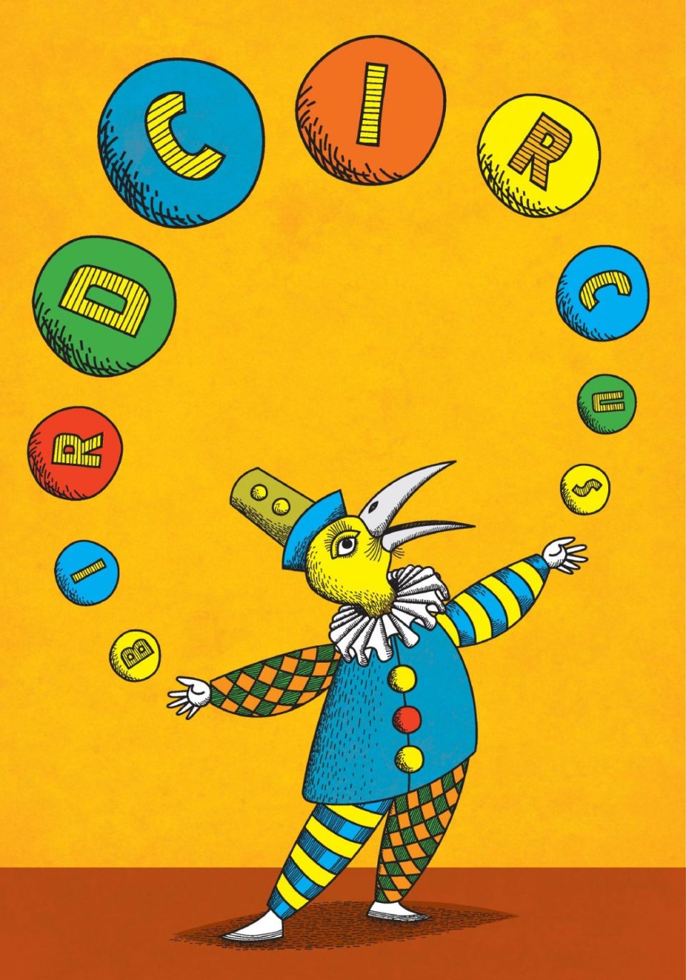
Bird Circus (formerly Bus Design Studio), is a creative studio formed by designers, illustrators and birdwatchers Amanda and Eden Cartwright. I’ve know Eden for a long time, having shared primary schools, high schools and University – we even lived in the same suburb until my recent move, you could say I’ve been an admirer of his work for a long time! Eden and Amanda, needless to say, have a plethora of beautiful design and illustration pieces on the Bird Circus website – along with some great photos of their studio space, very jealous. I also have to say, Bird Circus is a great studio name as well, Eden and Amanda sent me some beautiful printed promotional pieces to introduce the new name, (see above), the site itself is very well designed – I love the fun little animations they have going on. Check out their instagram account as well, worth it for the pic of old SA ice cream tins!
The Weather Maker
Over the years I’ve covered a lot of South Australian design firms and designers, I’ve always thought it is important to promote and recognise the creativity of local talent, especially considering the level of quality, for a small population we certainly punch above our weight. That level of creativity is matched by the various companies that contribute to the conception of the final product. I’m talking about the printers, the photographers, the digital producers and the sign makers who help turn designs into reality, so I’d like to start promoting covering some of SA’s finest manufacturers and producers as well, companies and individuals that have been behind the designs so to speak.
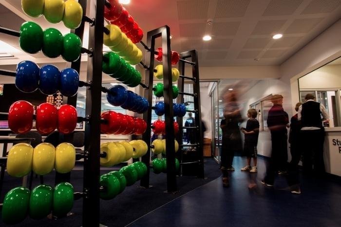
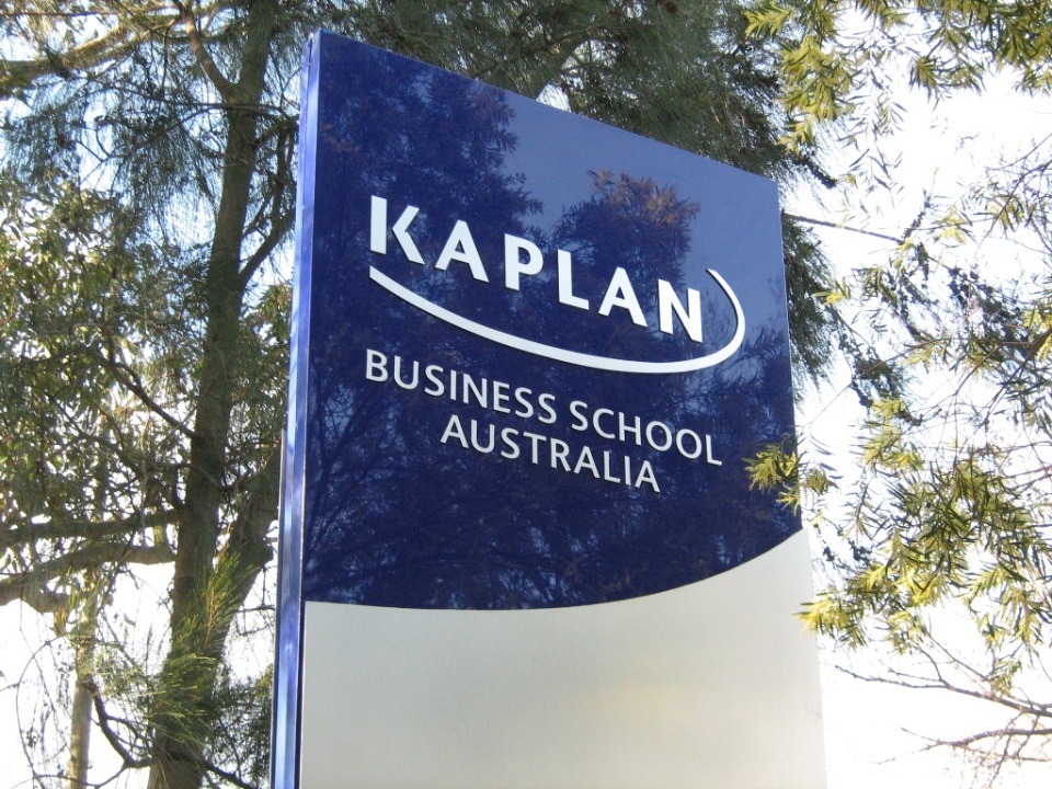
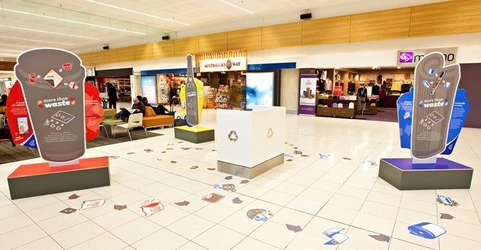
First cab of the rank is someone many local creatives will be familiar with for his fine craftsmanship over the years, David Sherwell, proprietor of signage company The Weather Maker (great company name as well!)
David has over 15 years experience providing commercial and architectural signage, wide format print and environmental graphic implementations. After successfully founding and operating Jack Rabbit Imaging for 10 years he continues his passion for sign and print through The Weather Maker. The Weather Maker provides sign, print & environmental graphic solutions for architectural, commercial and creative agencies.
The companies tagline ‘Changing the way we see the world’, is reflective of the companies consultative approach and commitment to supporting local architectural, commercial and creative industries. The Weather Maker uses this consultative approach to specify, proof, construct and install innovative sign solutions. Using the latest technology coupled with in-house production methods enables The Weather Maker to deliver timely sign projects of a superior quality.
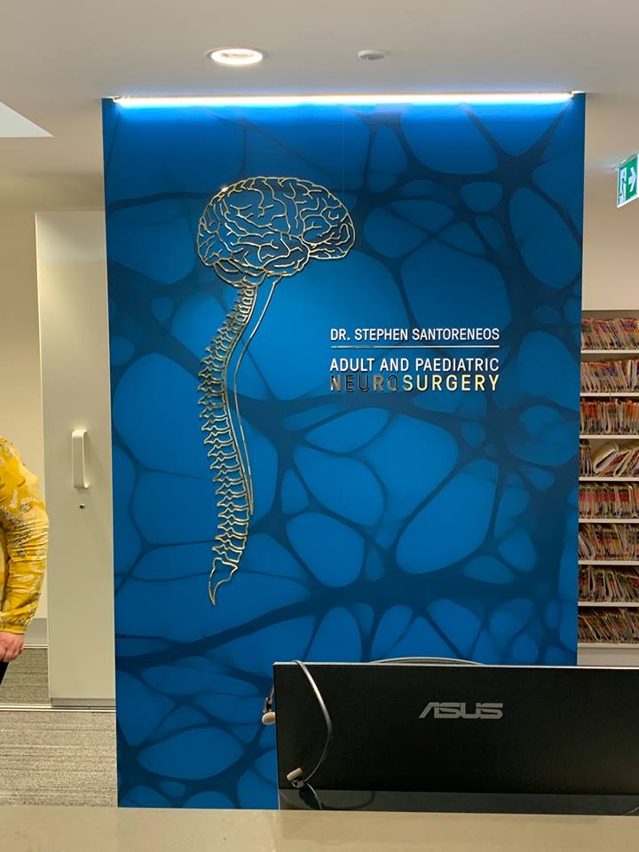
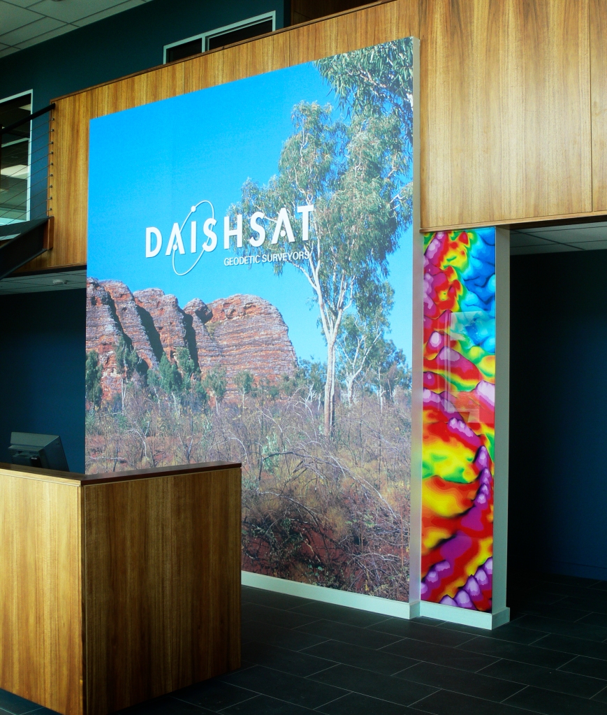
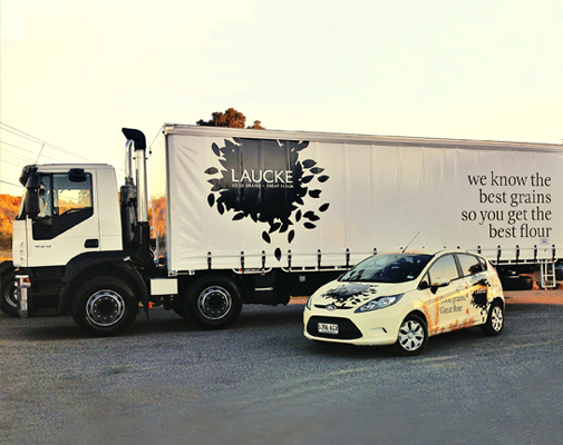
David remains passionate about managing and constructing commercial and architectural signage projects. He continually gets a kick from seeing sign and display projects across Adelaide that make a tangible market on this city. He also happens to be a really nice guy with a real commitment to quality, so you can be pretty confident that your designs are in safe hands. Check out some of his completed projects below and at theweathermaker.com.au
![]()
Vale Barrie Tucker
I was saddened to hear of the passing local creative luminary Barrie Tucker last Friday. Barrie was truly a trailblazer for anyone coming up through the creative industries in South Australia – I remember in my University years looking through a brochure of Tucker Design and being completely in awe of the work they produced. It really cemented in my mind that this is what I wanted to do with my life. While I never got to meet him in person, his work through the years was certainly a great inspiration, I’m sure I’m not alone in feeling that way. I spent the weekend looking back upon some of his great work, I urge you to do the same if you already haven’t – and finally, my condolences to his family, friends and all those who were lucky enough to have worked with him.
Fête Magazine
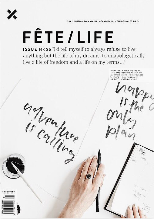
I just wanted to give a heads up for the latest issue of Fête Magazine that has just come out in the last few days. Fête is consistently one of the best design/lifestyle magazines released not just in Australia, but in the world, and the design and photography is beautifully considered with each issue. No. 25 is a particular standout, even amongst it’s usual level of quality with some great articles on minimalism, simplifying your lifestyle, and how to achieve that important work/life balance. There’s also lots of cool stuff to look it if that’s your thing as well! Fete have also been advertising for a mid-weight freelance designer, I don’t know if they’ve found that perfect candidate yet, but it would be an awesome opportunity to be part of such a great product. If you think you have the design chops (and you’re not too late to apply of course), drop them your details. Also, go and pick up a copy of the magazine of course, available around Australia where all such good magazines are sold – or you can check out all their list of stockists here.
Monday Load of Links
I am crazy obsessed with the African wild cat, the caracal. maybe it’s because just like them, I am an agile and fierce predator – of design links that is! I slap down a few of my own below.
Why are some people just more creative than others? I was kicked in the head by a pony when I was young, but I’m sure that can’t be the case for all of us.
This kids book on minimalism by the awesome Creative Director at Toko, Eva Dijkstra, is a thing of beauty indeed – great promotional site as well.
We don’t hear a hell of a lot about the design scene in India, but this short interview with graphic and typeface designer Shiva Nallaperumal, has me interested in learning a lot more.
Every design project I have worked on is tinged with a little regret over what I may have done differently, so it’s nice to know that in some respects this is a universal trait!
Wrestling from the 1970s seems like a really weird platform for modern day design inspiration, but you have to admit these old posters are a hipsters dream.
Does true originality stem from just a hint of madness? Or maybe it’s even more than just a hint.
Living the dream, and travelling the world. Is the life of a digital nomad just too good to be true, is it wrong of me to hate them regardless?
So it’s okay to copy now – have at it then!
As the year is ramping up (it’s March this week) it’s handy to have some tips on how to handle having too much to do.
Brisbane has always had a pretty awesome music scene, and along with it an interesting history of gig poster design.
It’s too late for me, but maybe this can be of benefit to any of you younger folk.
Whoops, too late for me again.
Is brutalism the next big thing in graphic design – or have we missed that boat already?
The Type Directors Club Annual 38
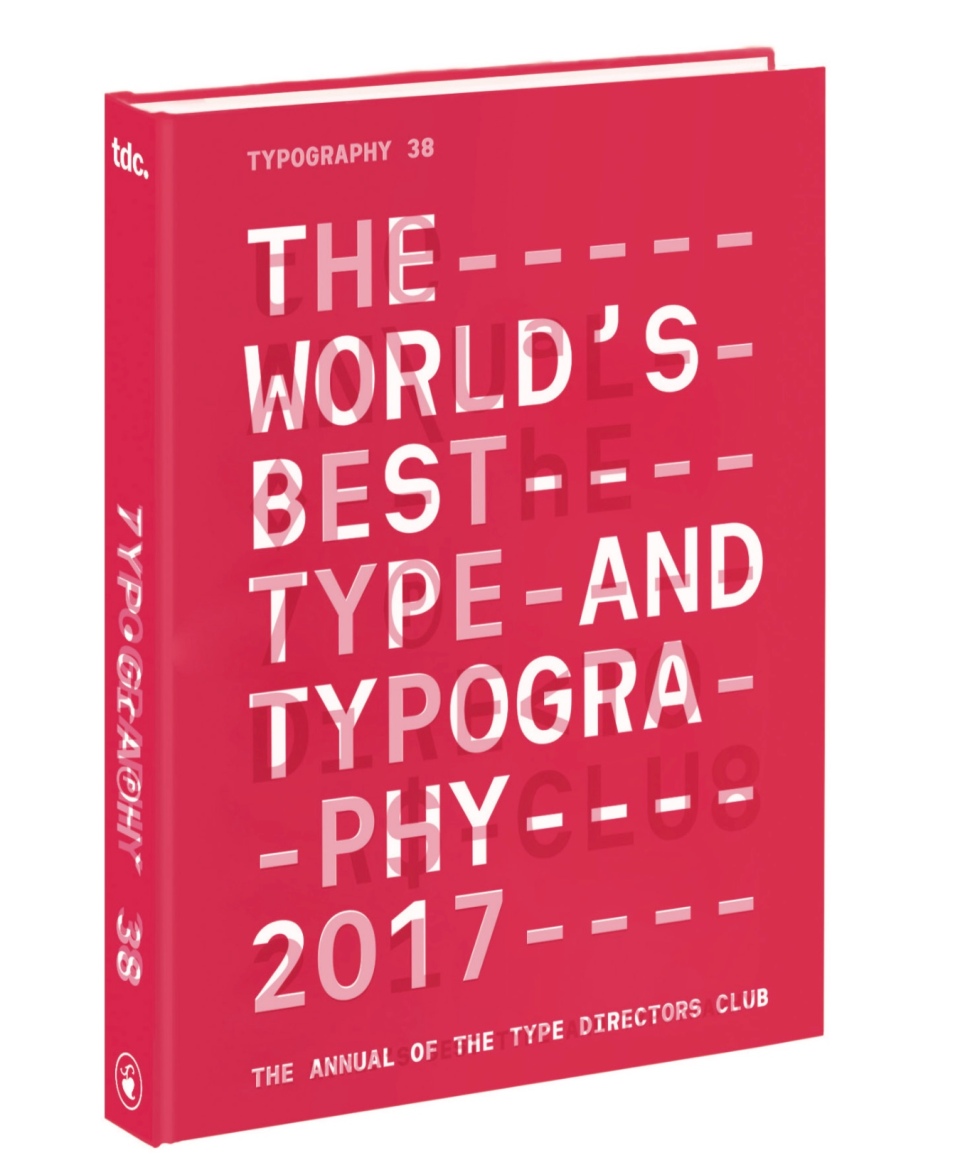
One of my singular pleasures of the year is when I receive my Type Directors Club annual in the mail. I’ve been a member since 2010 – one of the benefits of memberships of course is that you receive the beautiful Type Directors Annual each year, which, in my humble opinion, is the best curated collection of design examples from around the world year after year. Membership in the Type Directors club offers a lot more than just the annual though. It’s a way to connect and interact with the world’s very best designers, creative directors and typographers – and of course, if you work is up to standard, a way to present your very best work in front a very distinguished audience (Adelaide firms Voice and Studio Band were both awarded in the latest Type Directors awards for example (well done guys!) I thought I would share some of my favourite pieces from the latest annual, I’ll think you’ll agree it’s some cracking work.
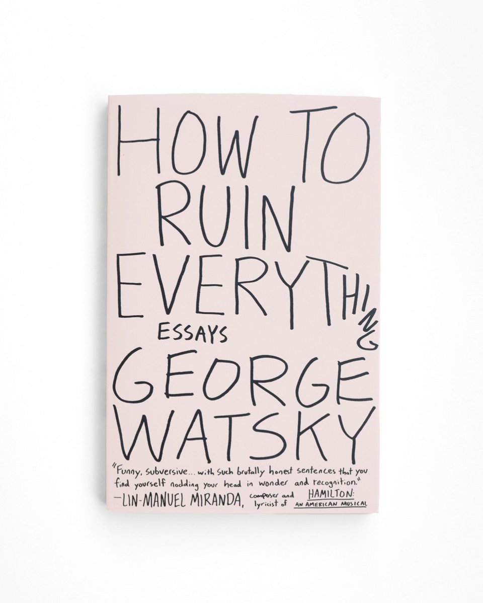
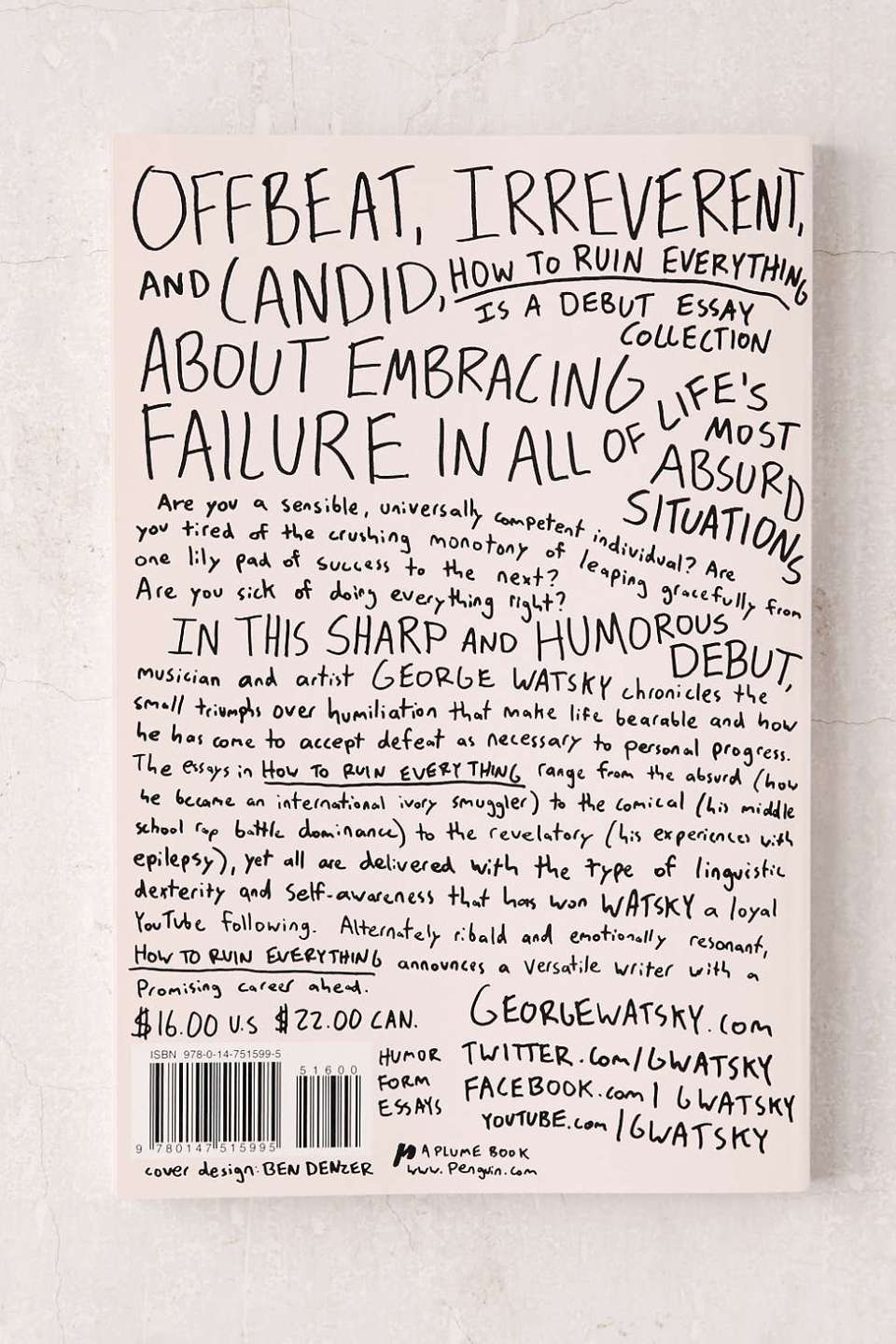
How to Ruin Everything: Essays By George Watsky
Design Ben Denzer Art Direction Jason Booher
I thought I would start off with what is probably my very favourite pieces in the whole annual. I wish I could spend my life designing book covers that look as care-free as this.
Just when you admire how beautiful the cover is, you then turn it over to see that the back cover may be even better. I remember being so knocked out by this when I saw it on the bookstore shelf that I immediately had to have it, just so I could admire that cover at leisure. Luckily for me that it is also an awesome collection of essays written by the very clever and very funny George Watsky – perfectly encapsulated in that cover.
Make sure you check out Ben’s site for some more of his awesome work.
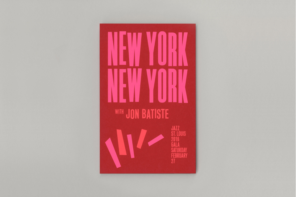
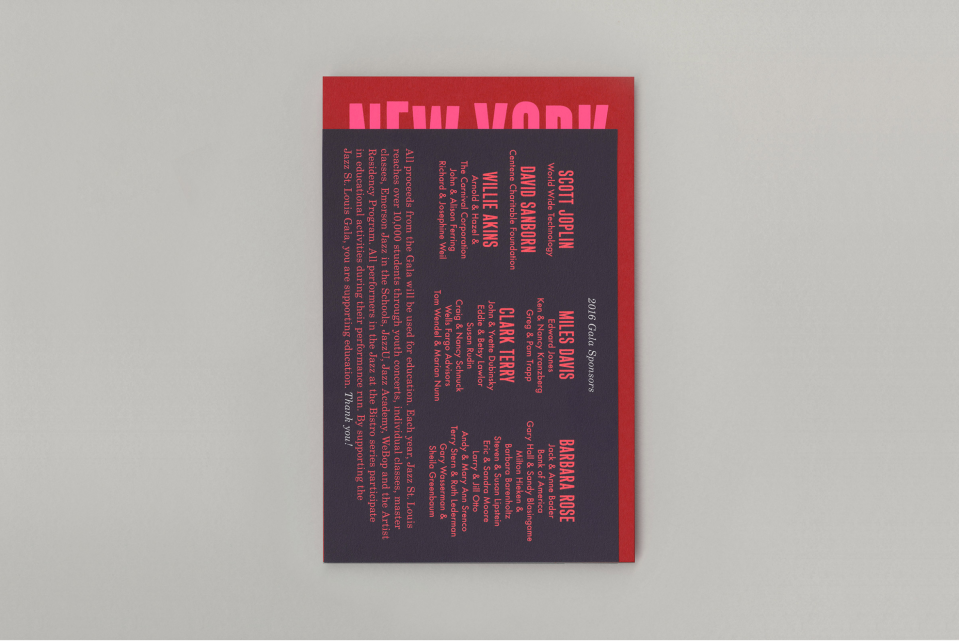
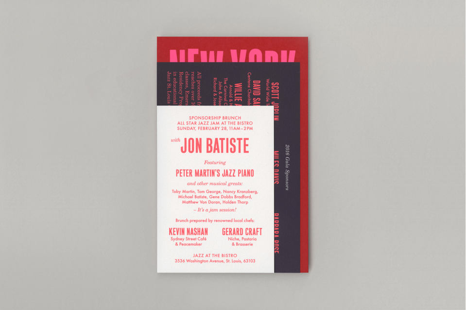
Jazz St. Louis Gala Invitation
Design Direction Sarah Newitt
Design Kiku Obata & Company
I really like how this invitation uses the vernacular of mid-century jazz album typography but modernises it with a contemporary typestyle update and the use of a modern neon colour palette. It’s sophistication is totally appropriate for its intended audience. I would want to go to this if I received it in the mail.
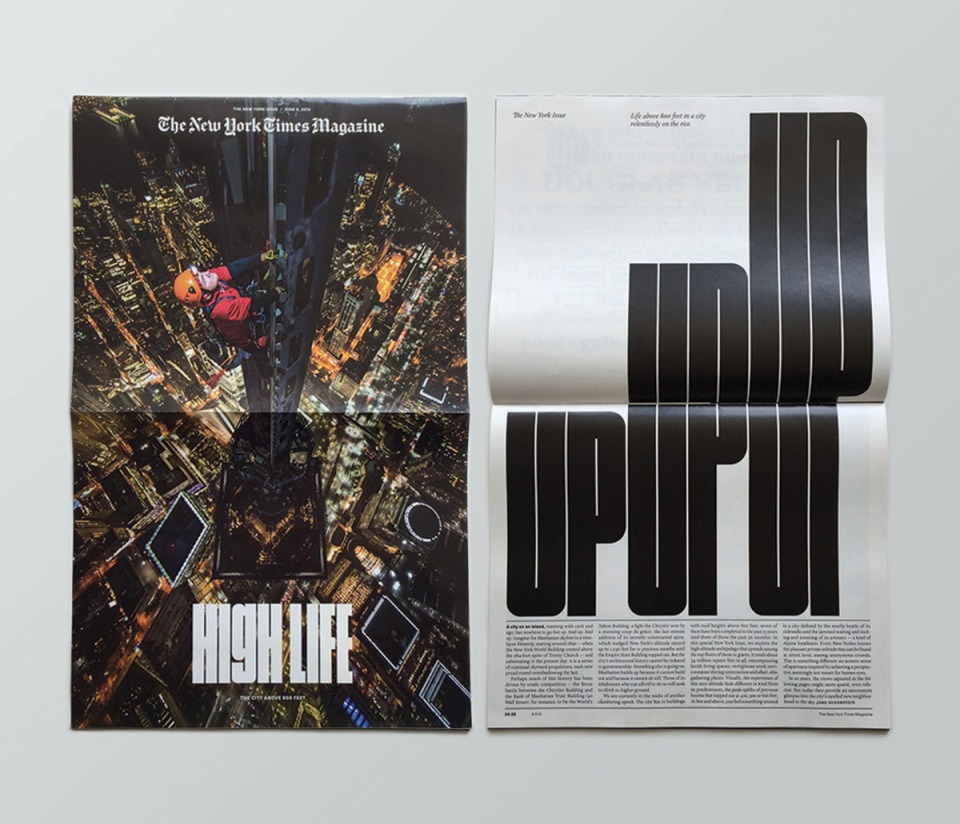
The New York Times Magazine
Design Frank Augugliario, Ben Grandgenett, Chloe Scheffe, Matt Willey
Design Director Gail Bichler
Art Direction Matt Willey
Deputy Art Director Jason Sfetko
The New York Times Magazine produces the goods week after week, displaying the very best publication design you can imagine. Gail Bichler and Matt Willey are two of my design heroes with what they are able to achieve with the NYT Magazine and a constant inspiration upon my own work. This issue turned it up a notch by turning the whole magazine 90 degrees as a play upon the issues subject matter: Life above 800 feet. Every detail is considered, down to a custom typeface to fit the heights of the new dimension. Keep in mind these guys are doing this sort of work on a weekly basis, check out the Winter Olympics issue they produced recently as another beautiful example of publication design going the extra mile.
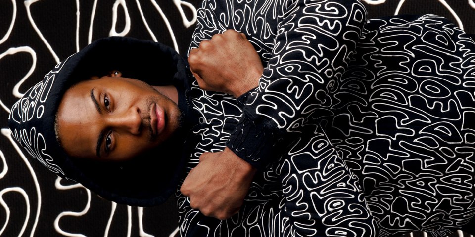
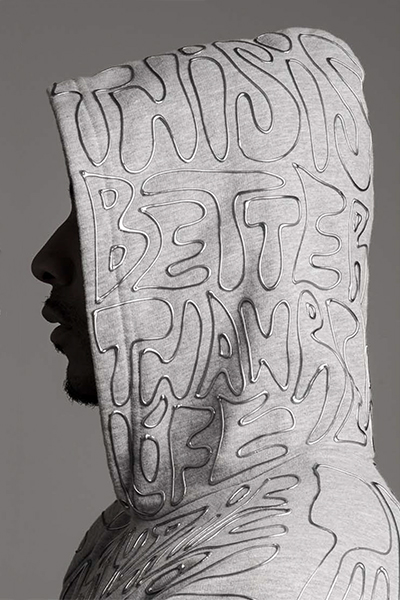
Just Another Unicorn Hoodies
Creative Direction and Calligraphy Mariana Castellanos
Most streetwear you see around the place these days is about as cool as something your grandmother would give you for Christmas – and most graffiti inspired designs are about as wearable these days has a hyper-colour t-shirt. These are something else though, tangible subtle lettering on muted colour backgrounds, they are a typography buffs dream attire. While ultimately they are ‘too rad’ for someone like me to wear, I could imagine someone cool like Chris Cooper or Nic Eldridge could pull it off.
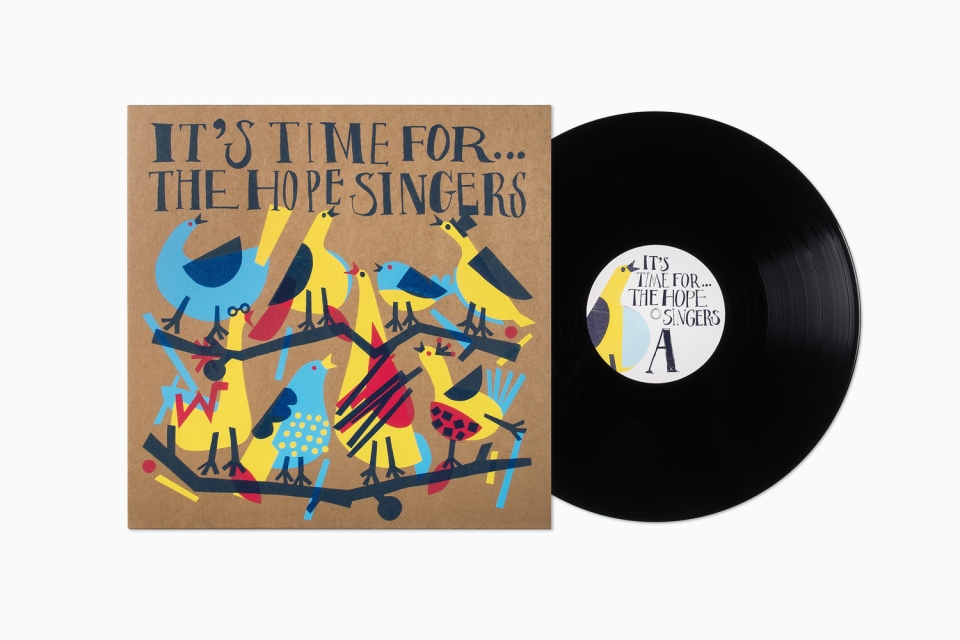
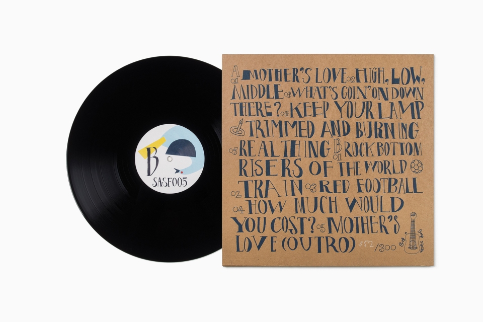
It’s Time For The Hope Singers LP
Design Mattias Amnäs, Anders Bollman, Fibi Kung
Creative Direction Perniclas Bedow
Calligrapher & Illustrator Fibi Kung
Design Firm Bedow
I’d seen this online a few months back and admired it, so I was as happy as could be to see that it was featured in the latest typography annual. It does this old heart good to see such considered typography used so well on an LP cover! Unfortunately by the looks of it, with a run of only 300, I’m imagining it’s not the easier of records to actually get a physical copy of.
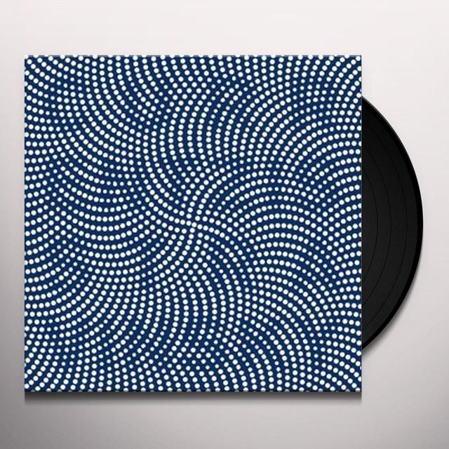
Stravinsky LP
Design Fons Hickmann, Lizzy Onck
Studio Fons Hickmann m23
Ok, squint your eyes a little bit. See it? Pretty clever play on the traditional Op Art technique. It’s the sort of music that is ripe for such interesting interpretation, but seldom is, which lets this particular design sit well apart from the pack.
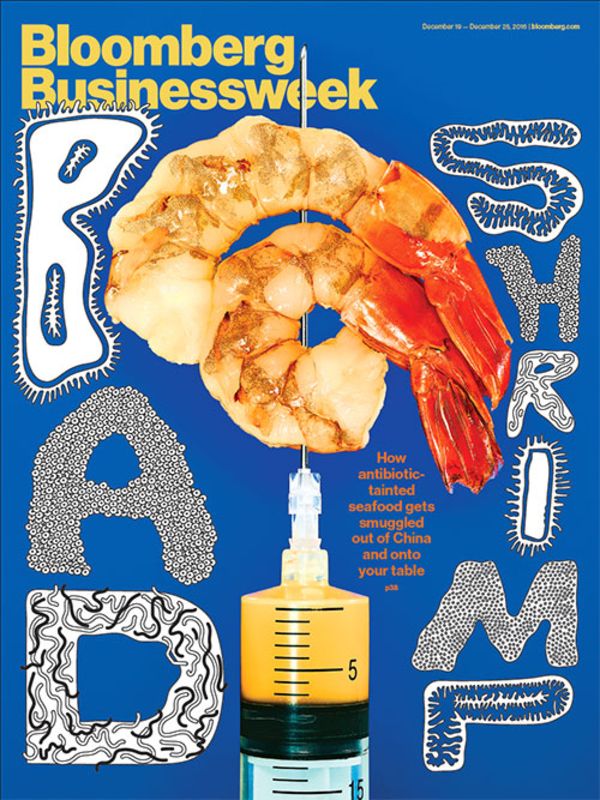
Bloomberg Businessweek Magazine
Design Simon Abranowicz
Creative Direction Robert Vagas
I’m not particularly concerned by the machinations of the business world on a weekly basis, but luckily I am enamoured by great design and typography, which must be the reason I’m quite often picking up copies of Bloomberg Businessweek. This cover is a real standout for a magazine that prides itself on producing stand-out covers. Bold, weird and king of icky at the same time – you wouldn’t think the subject matter would particularly lend it self to such an original presentation. But here we are, with Bloomberg Businessweek securing it’s regular berth in an edition of the Typography Annual. And the design inside is just as good.
So that’s just a brief overview of some of the gems waiting to be discovered in the latest Type Directors Annual (these ones I featured weren’t even selected as judges choices, so there is still a bounty of typographic excellence to be discovered. I will also urge you, if you have the means, to become a member of the Type Directors Club yourself if you are not already – personally I think it’s a small price to pay to be in the company of such extraordinary work – not to mention the designers and typographers behind it.
Monday Load of Links
Pine no longer, deliverance is at hand – it’s your late-in-the-day-lazy-old-list of the past weeks most interesting design links. Conveniently posted here so you don’t have to search so much.
Doing the most work doesn’t necessarily translate into doing your best work, how to keep your creativity when the pressure’s on.
It’s easy to get into the doldrums at this time of the year after the spark of getting back into working starts to dwindle – so check on what these designers are most looking forward to in the coming months to perk up your enthusiasm.
Can’t find that elusive font that you’ve spotted out in the wilderness? Maybe those letters don’t come from a font at all.
Khoi Vinh always has something thoughtful to add to the design discussion, but he’s getting worried that not enough of us are playing along.
Unit Editions have another great design book out, this time on the rubdown lettering solution of my wayward youth, Letraset.
Mark Farrow has had a long-standing relationship with the visual language of the Pet Shop Boys that continues to this day.
Rob Ryan is a man with much more patience that I think I could ever hope to muster. Check out his beautiful cut paper illustrations and how he goes about creating them.
Designers Who Are Better Than Me
I don’t spend nearly enough time on here discussing local illustrators (actually, I probably don’t spend enough time on here period). It’s not a deliberate omission, just a slackness on my part to go in search of them (so hey, if you’re an illustrator and want a possible shout-out drop me a line!) I’m envious of the particular skills and fortitude of the individual who devotes their life to the illustrative arts. That’s a particularly long-winded way of introduction to the awesome talents of the awesome Owen Lindsay. If you’re familiar with the Adelaide CityMag or it’s late lamented predecessor Collect Magazine then you would have seen Owen’s work – it’s always a bonus when his pieces are featured there-in (though you should be reading it regardless). Owen describes his style as fun + engaging – that’s a good start – I’m particularly fond of his info-graphics, there’s always a ‘Where’s Wally’ quality to searching through the illustrated tidbits and letting out a gentle guffaw when you ‘see what he did there’. It’s a fine line between cool and kitsch when you work in a cartoony style, but I’ve yet to see him cross over – don’t be fooled by the medium, this is eminently clever stuff designed with thought and care into subject, layout and colour. I like the fact that he’s also not a one trick pony, his illustration goes from loose and easy to tight and technical when need be. what I’m trying to say is it’s good stuff and you should definitely check out more of his work (and also pick up a copy of CityMag if you’re out and about in Adelaide).
Monday Load of Links
January, sick and tired you’ve been hanging on me. Yes I’m sick and tired of this heat and there’s still at least a couple of months of Summer to go here. Anyway, my enthusiasm for sharing the weeks best design links that the interwebs have to offer remains un-dampened. Go forth and be similarly entertained.
A designer’s job is never done, or does it just feel that way?
How to take design feedback from non-designers and not get your fee-fees hurt, or come at them with an axe – your experience may differ depending on feedback.
And on that previous note – waste not want not.
Most of us pretty much enjoy what we do in the design field – it’s certainly not for the recognition or financial incentives. It’s pretty easy to get sucked down that hole into becoming a workaholic (and a drag at social gatherings). If this feels like you, maybe the new year is a time to look into some recovery methods.
Maybe that’s why there’s such a preponderance of mental issues in the creative industry? This article concentrates on the web industry, but I think it’s stories carry across to anyone working in design.
And if you’re looking for some means to relax a little, this simple site may be a good place to start.
The Guardian has gone through a dramatic re-design.
Designer’s love ’em, why do they remain so addictive?
This is a great little resource brought to you by the folks behind Kickstarter. I’ve been slowly trawling through it.
Monday Load of Links
It’s Monday, so that means another load of links to start your working day off right and get your designer mind working on all cylinders with a road-up of some of the weeks best design post (and the usual dose of cat video goodness as seen above). Get at it!
It’s Nice That is the creative blog that Facing Sideways hopes to be one day when it grows up a little. In the meantime, check out their top 25 graphic design features for 2017.
Hamish Smyth is an expat Australian designer behind publisher Standards Manual and design studio Order. Design Week recently asked him ‘What will graphic design look like in 2018?’ and answered with some thoughtful ideas.
Apparently companies are finally listening to designers (and it’s only taken 70+ years, give or take)! This is what you need to know before you take that seat at the boardroom table.
If I see the name ‘Beatles’ mentioned in conjunction with the word ‘designer’ my eyes are immediately going to light up. Gordon House was an artist/designer who contributed to the visual palette of said super group as well as a mess of other significant touchstones of the swinging-sixties, yet remains relatively unknown today.
The humble pencil is usually the first instrument we turn to when sketching out an idea, and who doesn’t find some meditative release in the simple act of sharpening the point, reader to transfer though to paper? Do we ever give much thought to where said instrument originates or how it’s made? Read then this interesting report on one of America’s last pencil factories.
If you haven’t grabbed yourself a copy of designer/illustrator Noma Bar’s new monograph Bittersweet, do so at your nearest convenience. In the meantime, read this great piece on him over at Creative Boom.
As social media becomes more and more prevalent in society, its ethical implications also become more pronounced. The answer may lie in better design.
Finding it hard to get motivated on that personal project that’s been percolating for a while? Maybe you need to finally set a deadline, or maybe you don’t.
Heath Killen has set up shop and is working under the monicker of Honeymoon. Heath is a real ‘designer’s designer’ and one of the top talents operating out of anywhere with a very inspiring attitude towards life and the profession of design. Check out some of his beautifully imagined past and present projects ay his new site.
